Vizora - Virtual Try On
Vizora is a B2B SaaS virtual try-on app that lets shoppers see ring jewelry on their own hand in real time or on an uploaded photo, for a realistic online shopping experience.
The Problem & Challenges
Inability to try before buying: Online shoppers lacked a way to see how rings would look on their hands in real-time, leading to purchase hesitation.
- Complex inventory: Managing vast inventories of products required a system flexible enough to handle 1000+ assets without performance issues.
- Poor user interface standards: Competitor tools offered clunky, unintuitive interfaces that frustrated users rather than engaging them.
Complex technical integration: Existing market solutions were difficult for retailers to implement and often required excessive time to set up.
Market execution gap: Despite high demand for digital jewelry shopping, the market lacked a potential virtual try on tool.
The Solution
- Mobile-first Virtual Try-On: Developed a responsive application that allows users to view rings on their own hands using their smartphone camera.
- Streamlined back-end management: Designed a user-friendly UI that allows store owners to easily manage extensive product catalogs.
- Intuitive consumer interface: Created an inviting design that encourages users to interact with products, differentiating the tool from competitors.
- High-fidelity visualization: Focused on realistic rendering to ensure digital rings matched the look and feel of the physical products experience.
My Role
End-to-end ownership: Led the work from early discovery through launch, shaping the direction based on real client feedback.
Hands-on design leadership: Personally worked on structure, flows, and interface decisions while guiding another designer on visual execution.
Close collaboration with engineering: Worked daily with developers, reviewed staging builds, and shared clear implementation notes.
Quality assurance before launch: Tested the experience across devices and finalized decisions only after ensuring consistency and usability.
Post-launch optimization: Continuously refined the experience after release based on real usage and feedback.
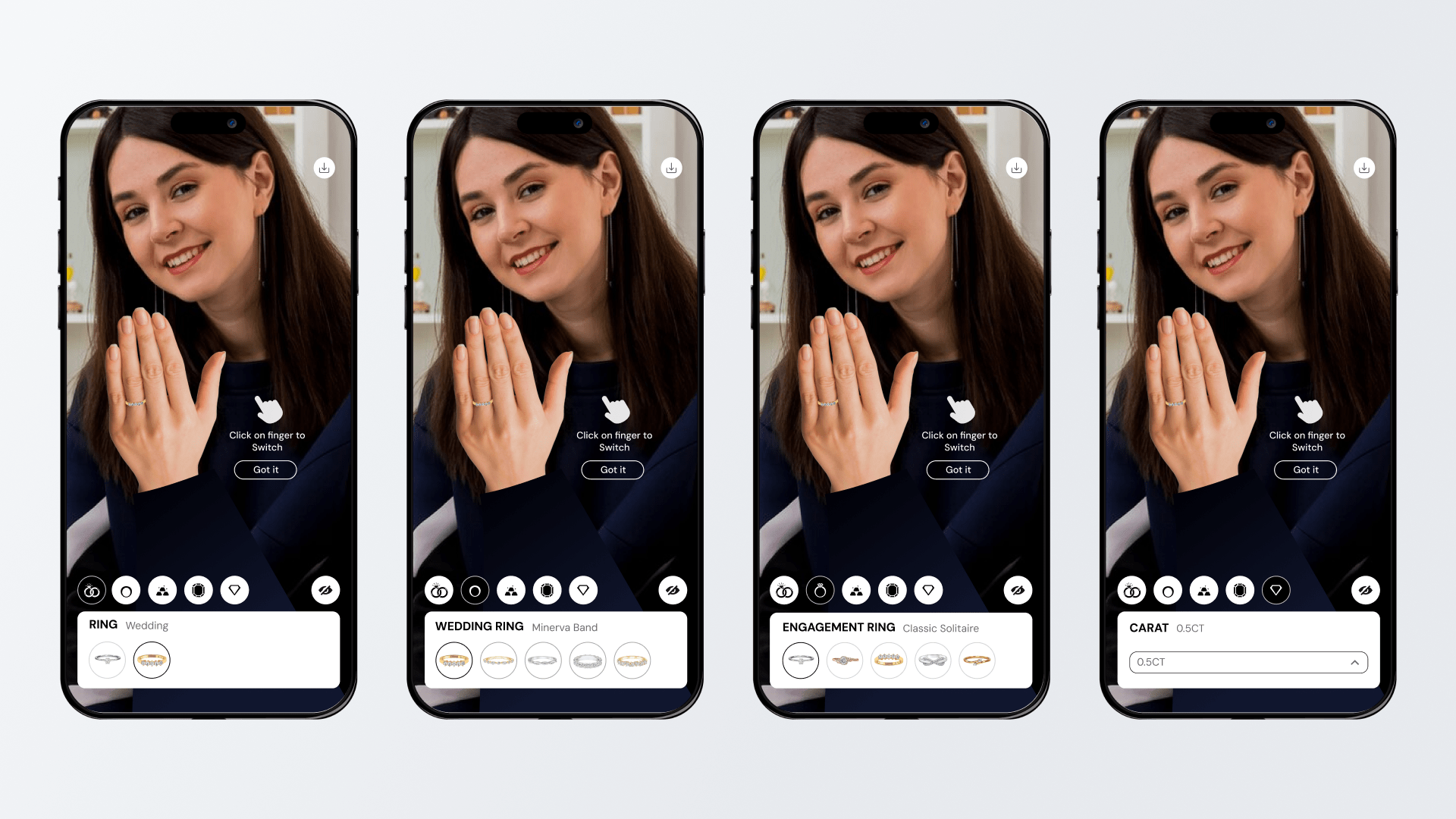
First Release as a Feature-Heavy Prototype
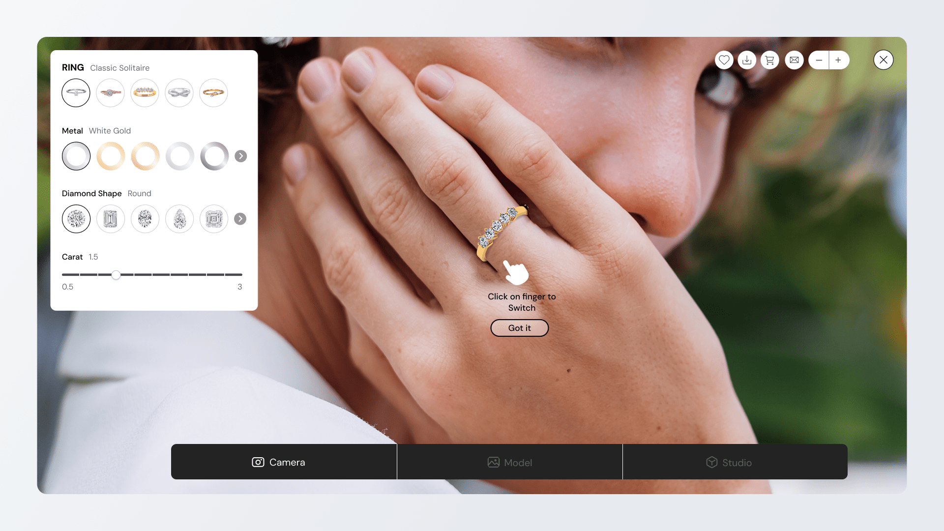
Launched as a powerful early build: Released the first version as a rich prototype that included many configuration options in a single desktop view.
Revealed usability issues early: Testing showed users felt overwhelmed and spent more time understanding the interface than evaluating the ring itself.
Distracted from the core decision: The most important moment, seeing how the ring looked on the hand was overshadowed by UI controls.
Unclear action priorities: Key actions like capturing an image or switching fingers were not visually prominent, making them harder to discover.
Triggered a strategic shift: Insights from this release led to the decision to move toward a simpler, more focused interaction model.
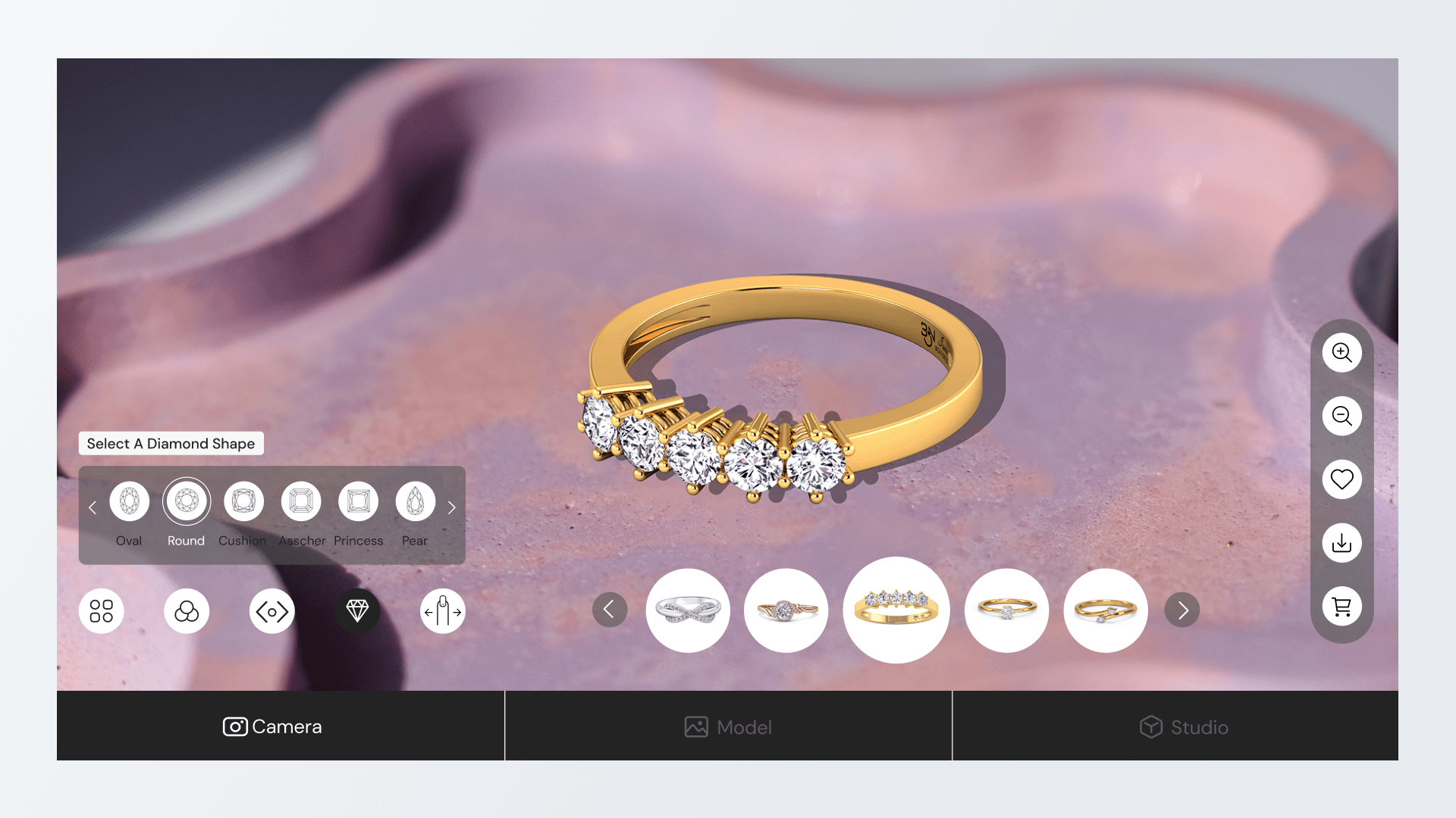
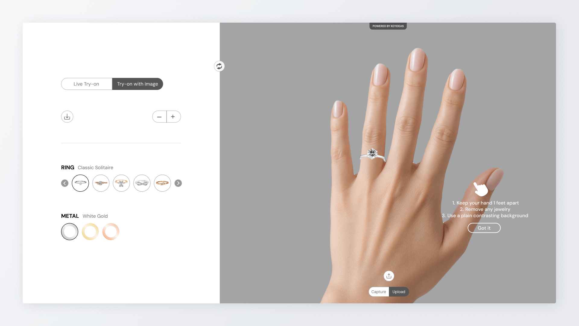
Redesigned Try-On Experience
Refocused the core decision: Rebuilt the experience around one key question: whether the ring looks right on the user’s hand.
Removed unnecessary complexity: Reduced on-screen controls to only the choices that mattered most, removing options that added confusion.
Improved visual clarity on desktop: Rebalanced the layout to give the ring more visual space while keeping controls structured and easy to scan.
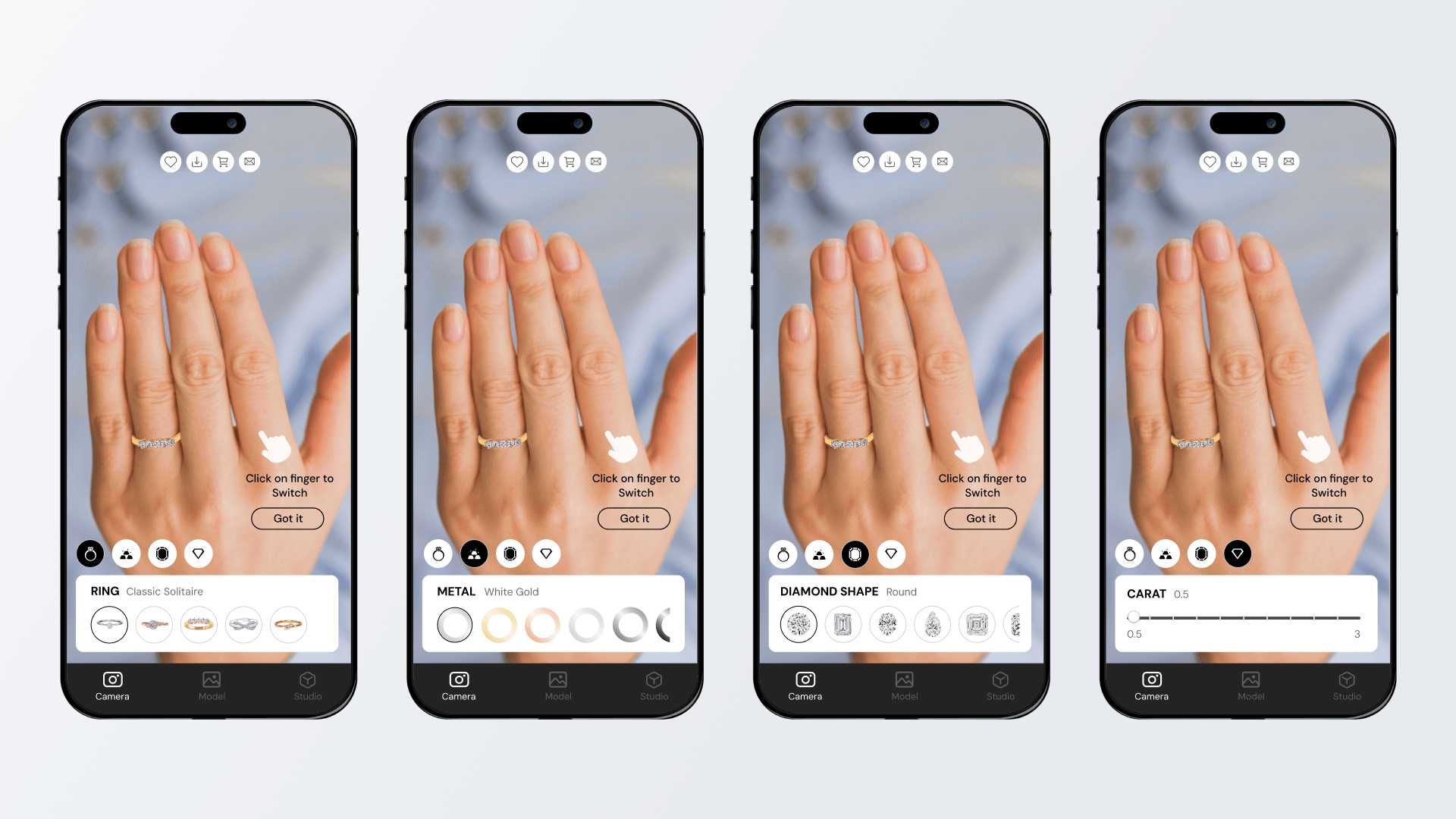
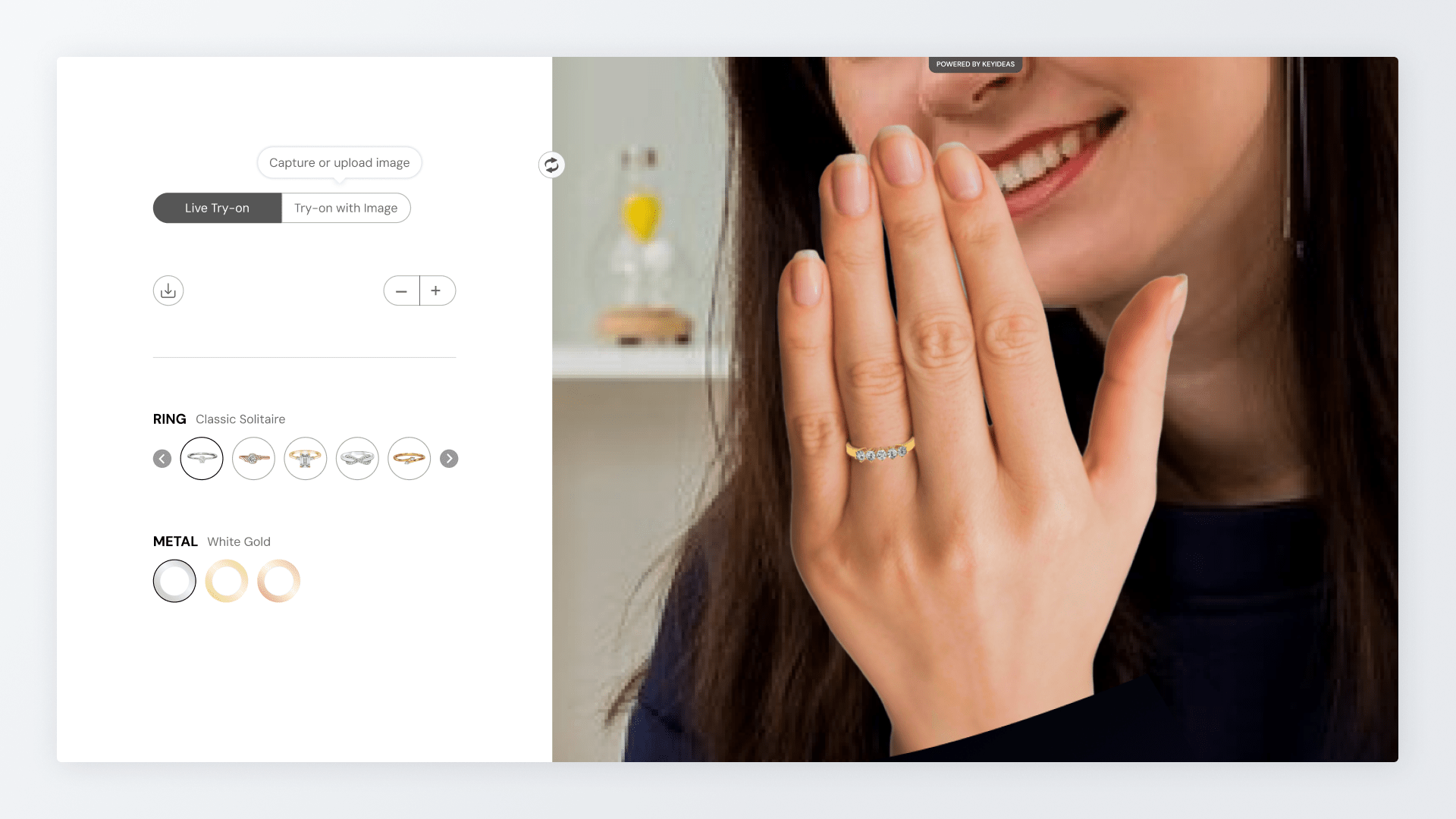
Added personal try-on capability: Introduced hand photo upload so users could see the ring on their own hand.
Clarified guidance through language: Rewrote instructions in plain, simple wording to help users position their hand and switch fingers without friction.
The Impact
- Increased purchase confidence: Allowed shoppers to visualize products realistically, the tool helps reduce uncertainty and drives higher conversion.
- Reduction in return rates: Accurate visualization helps set the right expectations regarding look and style, decreasing returns based.
- Extended user engagement: The interactive nature of the try-on experience encourages shoppers to spend more time on the site.
- Faster time-to-market: The simplified backend allows businesses to launch and update their digital catalogs significantly faster than with legacy tools.
- Brand perception: Providing a seamless, modern shopping tool helps retailers position themselves as customer-centric and innovative brands.