Luxury Jewelry Store Redesign
Dimend Scaasi is a Chicago-based luxury jewelry brand with 25+ years of heritage in engagement rings, wedding rings, diamonds, fine jewelry, and Swiss watches.
The Problem & Challenges
- Outdated Visual Experience: The existing UI felt old and failed to reflect a premium brand or encourage purchases.
- Low-Performing Product Pages: Product detail pages lacked clarity, trust, and structure, making it harder for users to complete purchases.
- Ineffective Homepage: The homepage did not stand out visually, build trust, or guide users clearly toward high-value actions.
- Lack of Education and Trust Signals: Users had limited access to educational content and credibility cues needed for high-value buying decisions.
- SEO and Scale Constraints: The redesign needed to improve organic visibility while supporting 500+ products and 10,000+ diamond pages.
- Inability to expand product lines: The site architecture could not seamlessly integrate a new category of luxury watches alongside the existing jewelry.
The Solution
- Modernized the Visual Language: Redesigned the UI to feel premium, and aligned with luxury customer expectations.
- Redesigned the Product Detail Experience: Created a clearer, more trustworthy product page focused on higher sales.
- Reimagined the Homepage for Conversion: Designed a distinctive homepage that builds trust, and directs users toward buying actions.
- Introduced Education-Led Content: Added structured education pages and blogs to help users learn about products.
- Luxury watch expansion: I built dedicated landing and listing pages to successfully introduce luxury watches as a major new product category.
- Built a Scalable, Unified PDP System: Designed one flexible product page that works across jewelry, diamonds, and luxury watches at scale.
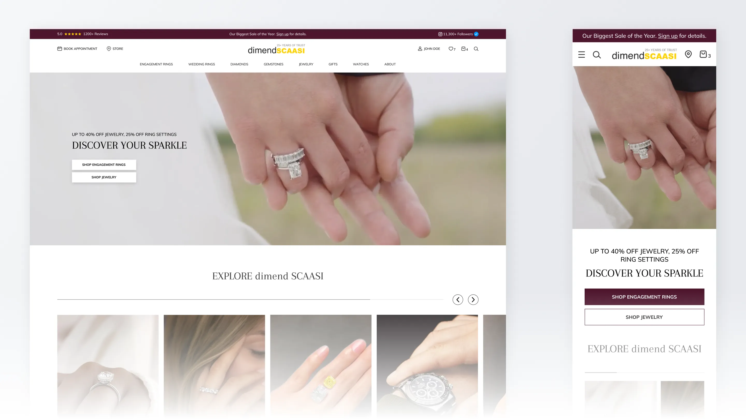
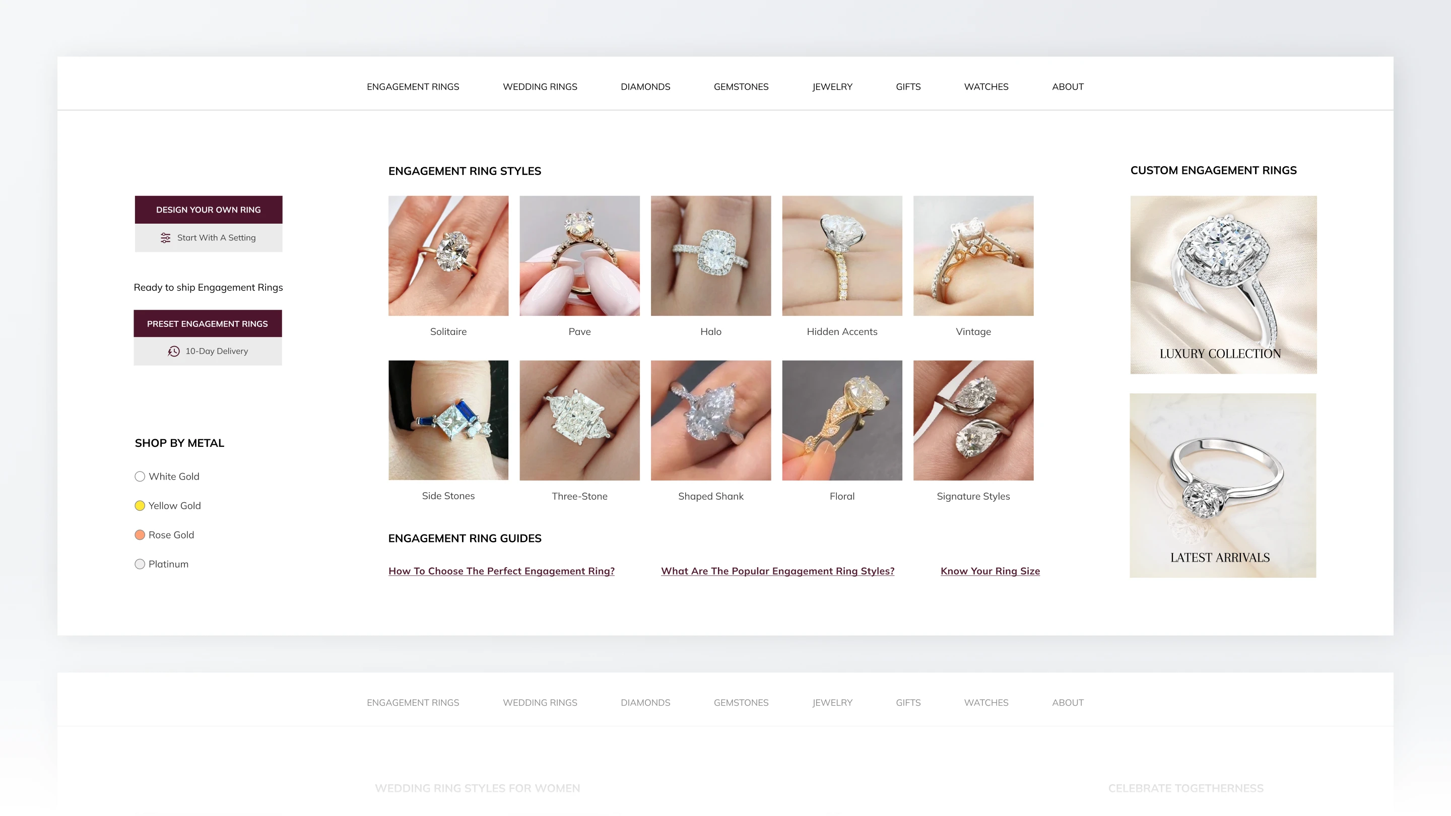
Homepage - Building Trust and Conversion
Strategic visual differentiation: I moved away from generic industry layouts to build a unique identity that highlights 25 years of experience.
Optimized product discovery: High-impact hero sections and curated collections were introduced to immediately guide users toward purchase.
Design for conversion: Hierarchy and distinct CTA were used to direct user attention specifically toward high-revenue items and key drivers.
Building buyer confidence: Factors like customization, certifications, and sustainability were prioritized to reduce hesitation during the shopping.
Streamlined mobile experience: The mob UI was simplified with vertical scrolling and accessible navigation to ensure a fast browsing experience.
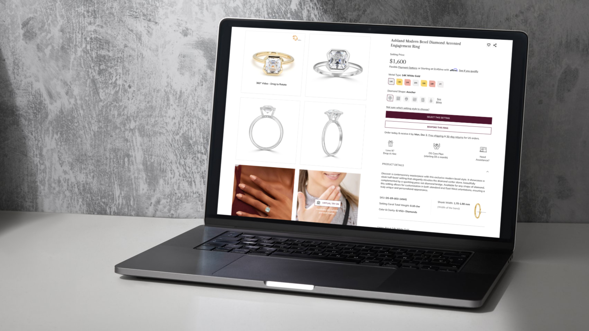
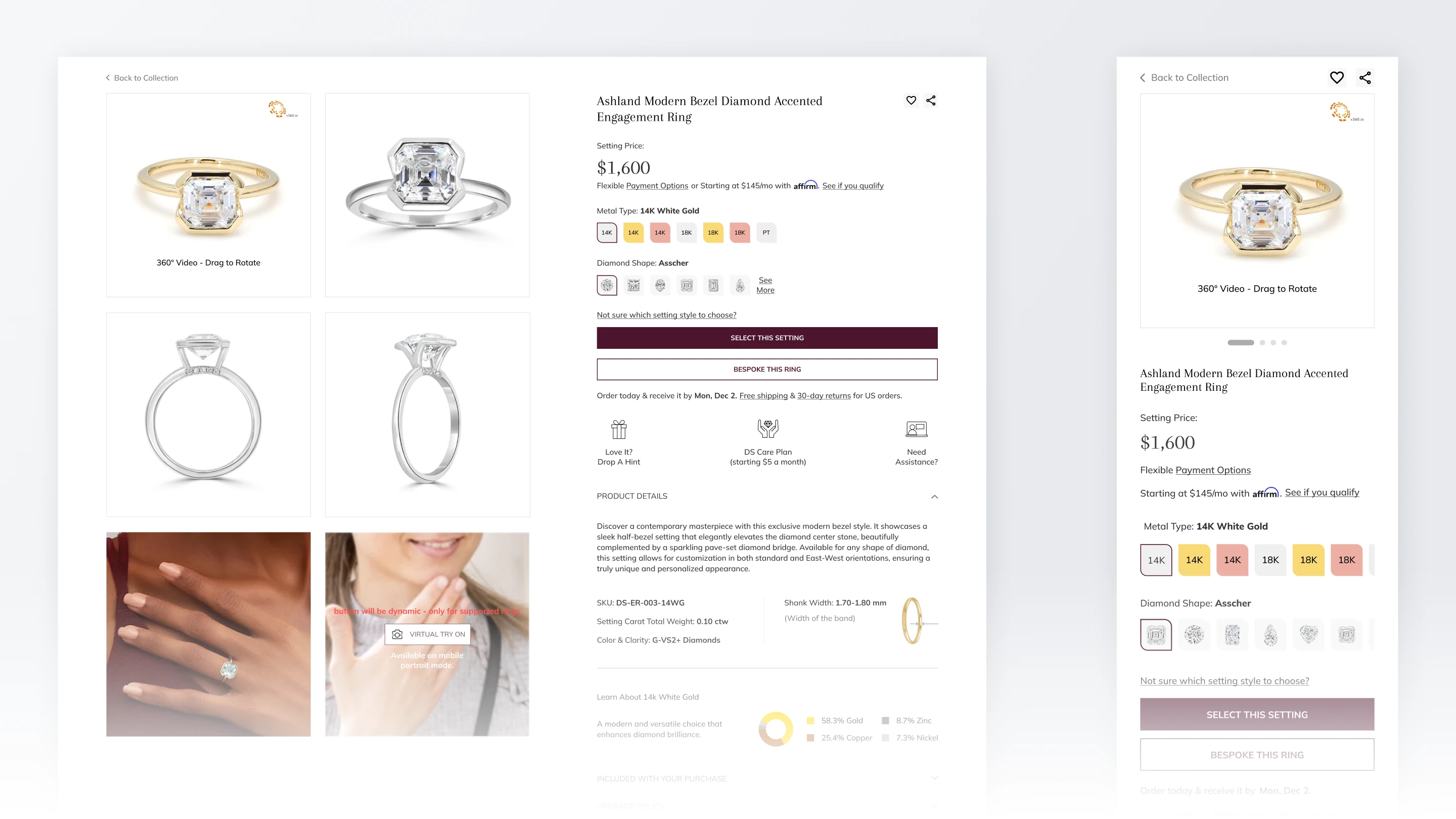
Product Detail Page Experience
Simplifying complex product data: We structured the page to display intricate ring specifications and diamond options clearly, ensuring users can navigate choices without feeling overwhelmed.
Highlighting key decision drivers: Critical information like pricing and personalization tools was prioritized to capture immediate interest.
Progressive disclosure of details: Secondary information, such as diamond certificates was organized into expandable sections to keep the UI clean.
Building trust through design: A transparent information structure to give users the confidence needed to make high-value purchases online.
Optimizing the path to purchase: Strategically designed to allow users to explore product variations while keeping the buying actions easy.
×
![Full Case Study]()
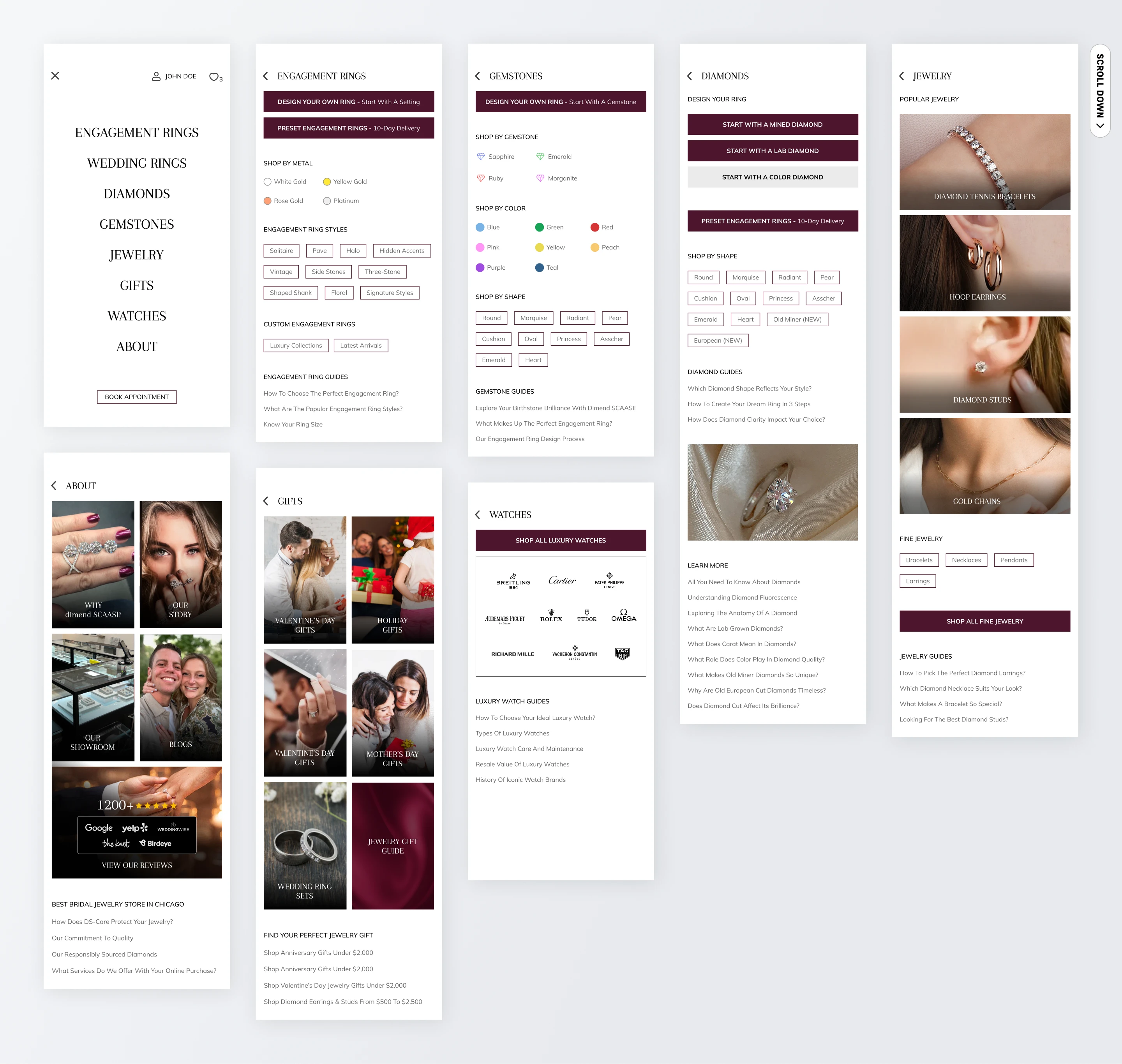
Mega Menu System - Product-First Navigation
Catalog organization for speed: I restructured the extensive product inventory into logical groups for quicker access to deep pages.
Intuitive visual guidance: By using iconography and concise labels directs users toward their desired category without cognitive friction.
Strategic category prioritization: High-value product categories are surfaced first, ensuring that business-critical items receive the most visibility during the initial user interaction.
Contextual support surfacing: Supportive pages, such as financing and educational resources, were placed near purchase touchpoints.
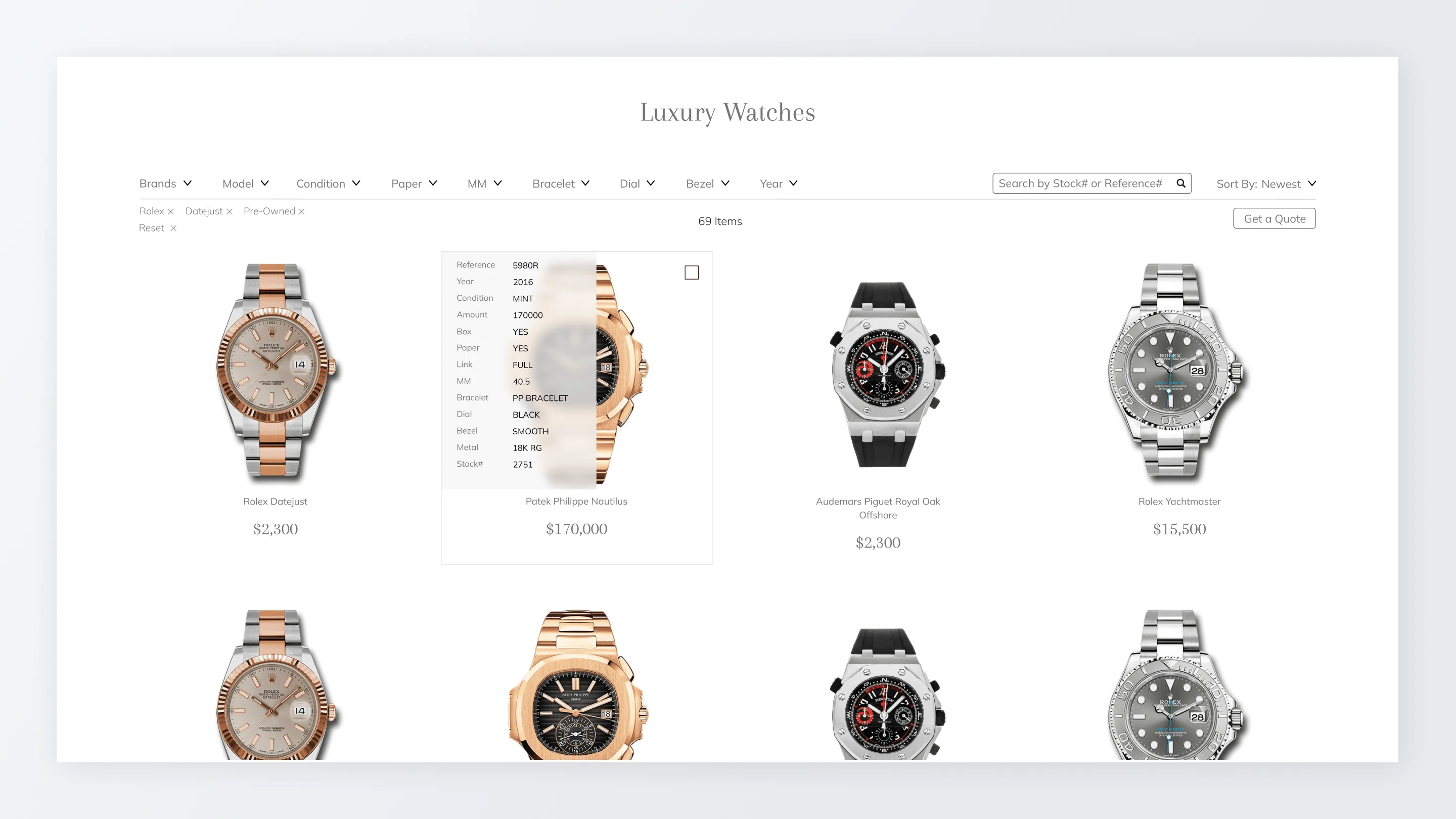
Watch Browsing Experience
The watch listing page required a different tone. Dimend Scaasi is an authorized dealer of major Swiss brands including Rolex and other luxury names. The experience is positioned around authenticity, rarity, and expert curation, not discount-driven e-commerce.
The UI emphasizes model families, condition, certification, pricing visibility, and direct inquiry actions. The card grid uses more negative space, restrained color, and technical typography to communicate luxury, especially for brands where pricing transparency builds trust. The mobile layout makes comparison easier through scrollable filters and consistent card proportions.
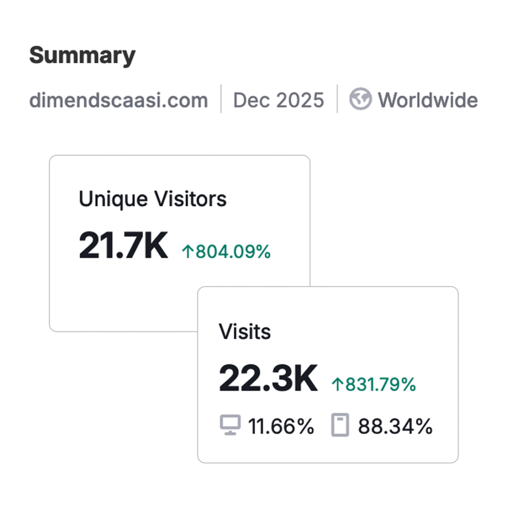
The Impact
Increased organic traffic: The focus on education pages/blogs and SEO structure led to a measurable rise in high-quality visitors.
Higher conversion rates: Redesigning the product pages and adding trust elements resulted in more visitors turning into paying customers.
Improved search rankings: The site achieved better positions in search results, driving sustainable long-term visibility for the brand.
Successful catalog scaling: The new design system now supports 10,000+ items effortlessly.
Diversified revenue streams: The seamless integration of the luxury watch category allowed the business to successfully expand its market reach.
Enhanced user engagement: Customers are spending more time on the site exploring the new educational resources and product lines.
×
![Full Case Study]()