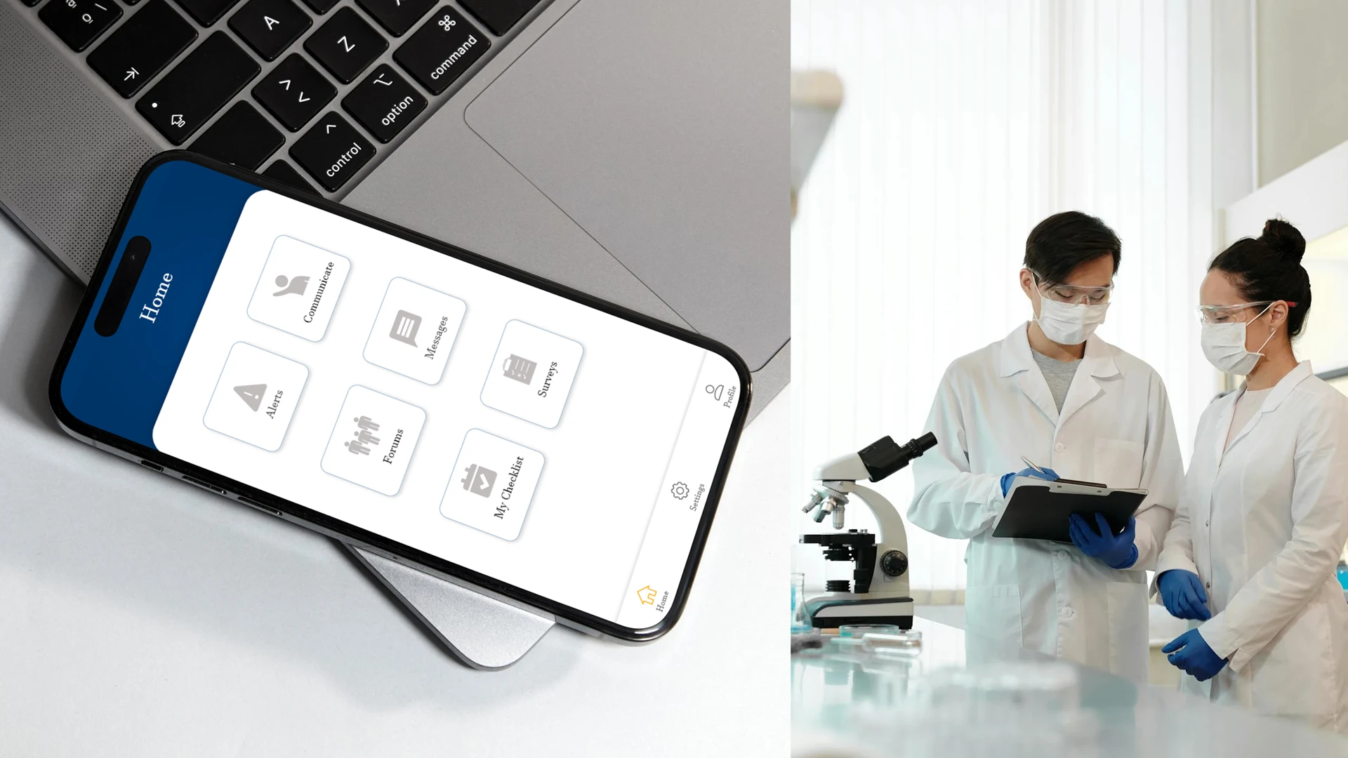
Portolo is a healthcare-focused knowledge exchange platform designed for medical, research, and clinical professionals. The product enables structured questions, expert responses, follow-ups, and issue reporting within regulated healthcare environments. Unlike public Q&A platforms, Portolo operates in a controlled, enterprise context where clarity, traceability, and workflow accuracy are critical.
I led the complete product design for the mobile experience, from research and workflow definition to wireframing and final UI. The work focused on translating complex medical communication flows into a usable, compliant, and scalable mobile interface.
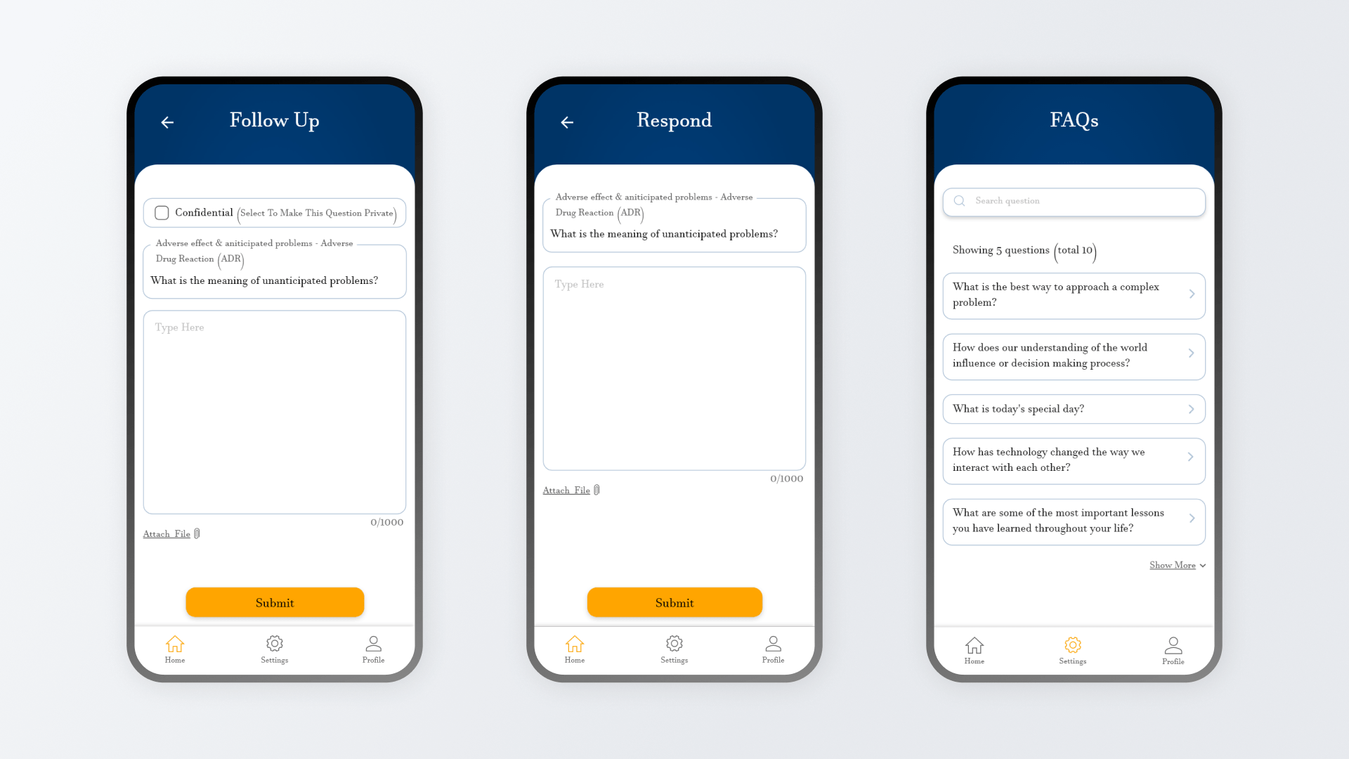
Designing Structured Medical Communication
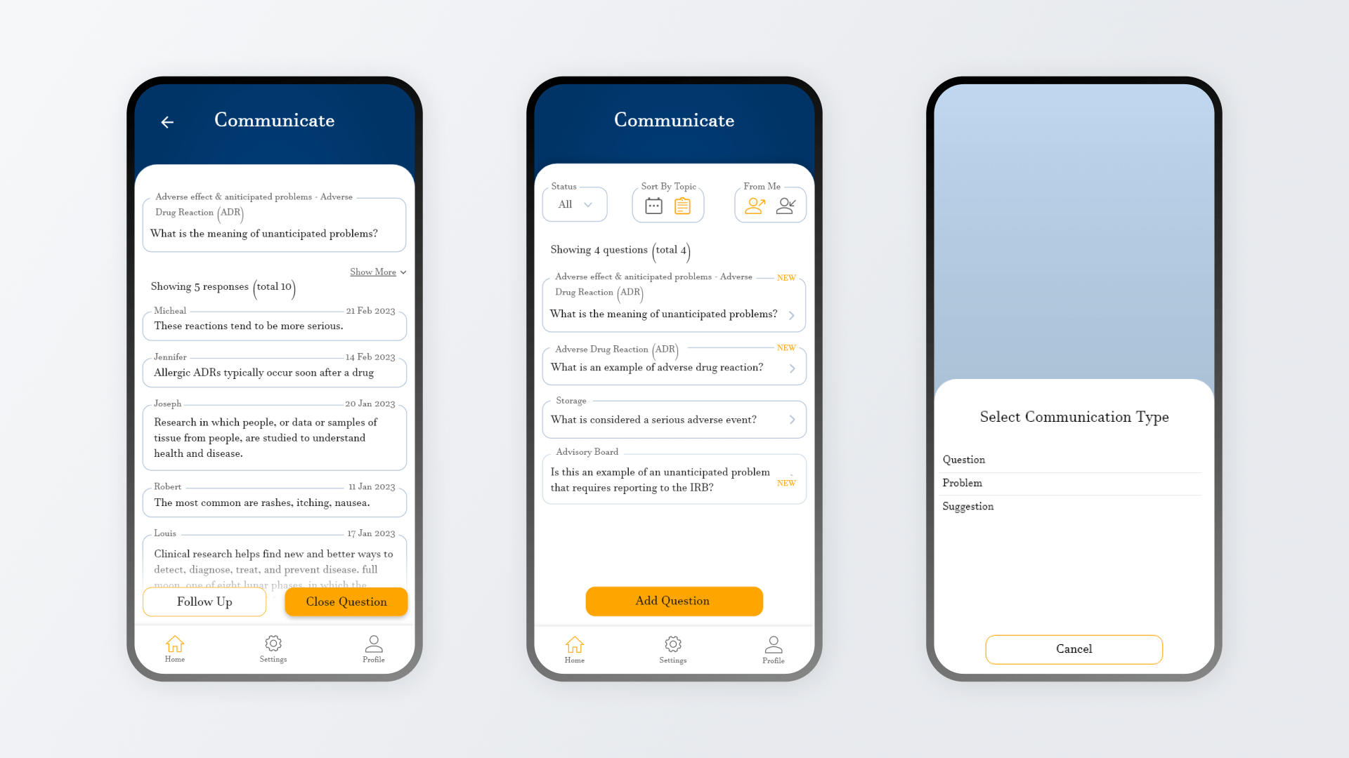
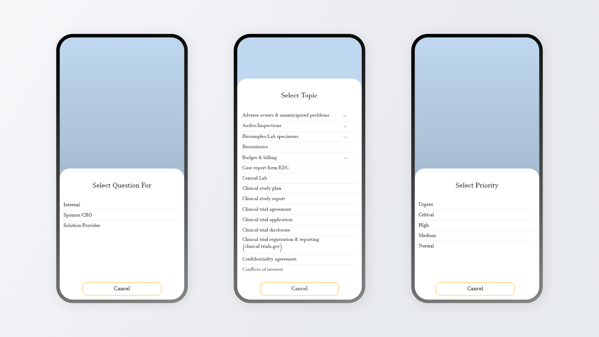
The core experience centers around asking questions, responding, and following up within defined medical and research contexts. The UI was designed to support different communication types such as questions, problems, and suggestions while maintaining structure and accountability.
Interaction patterns prioritize readability, status visibility, and context awareness so users can quickly understand what requires action, what is pending, and what has been resolved.
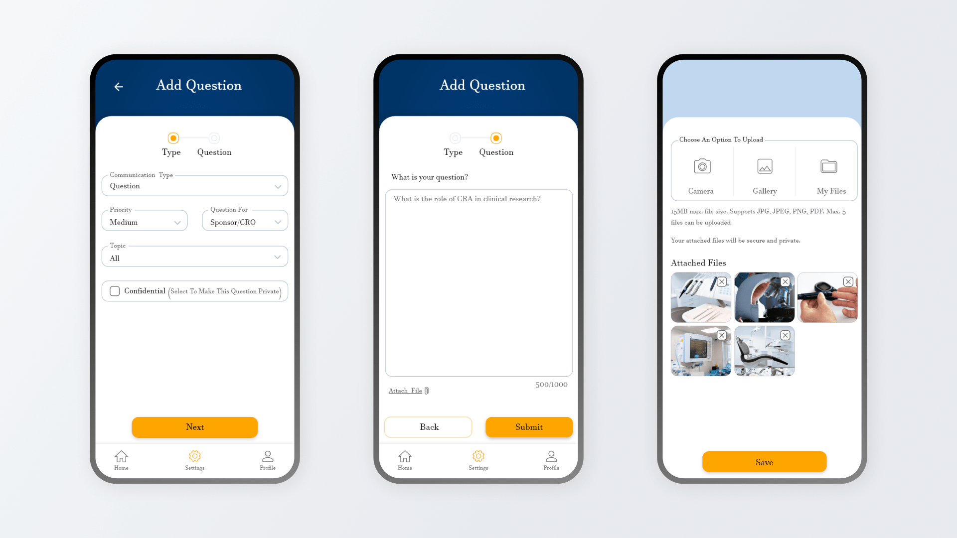
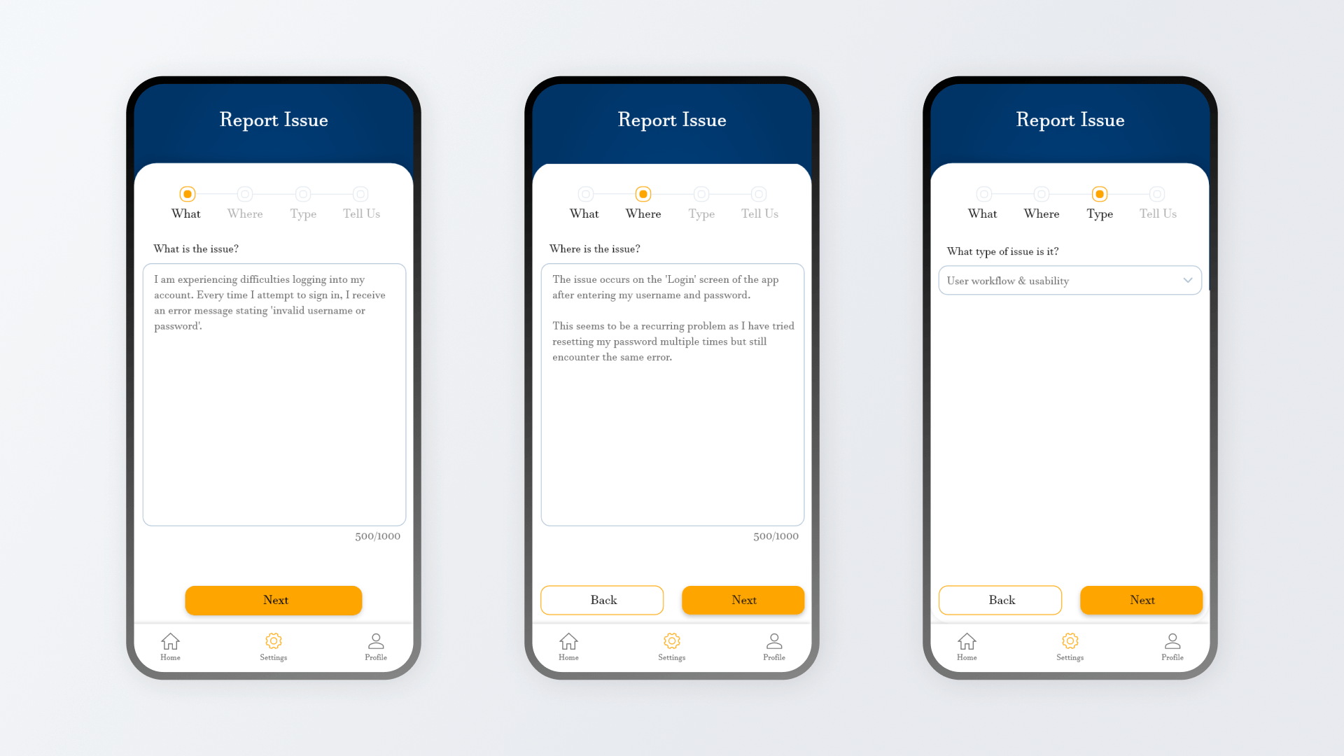
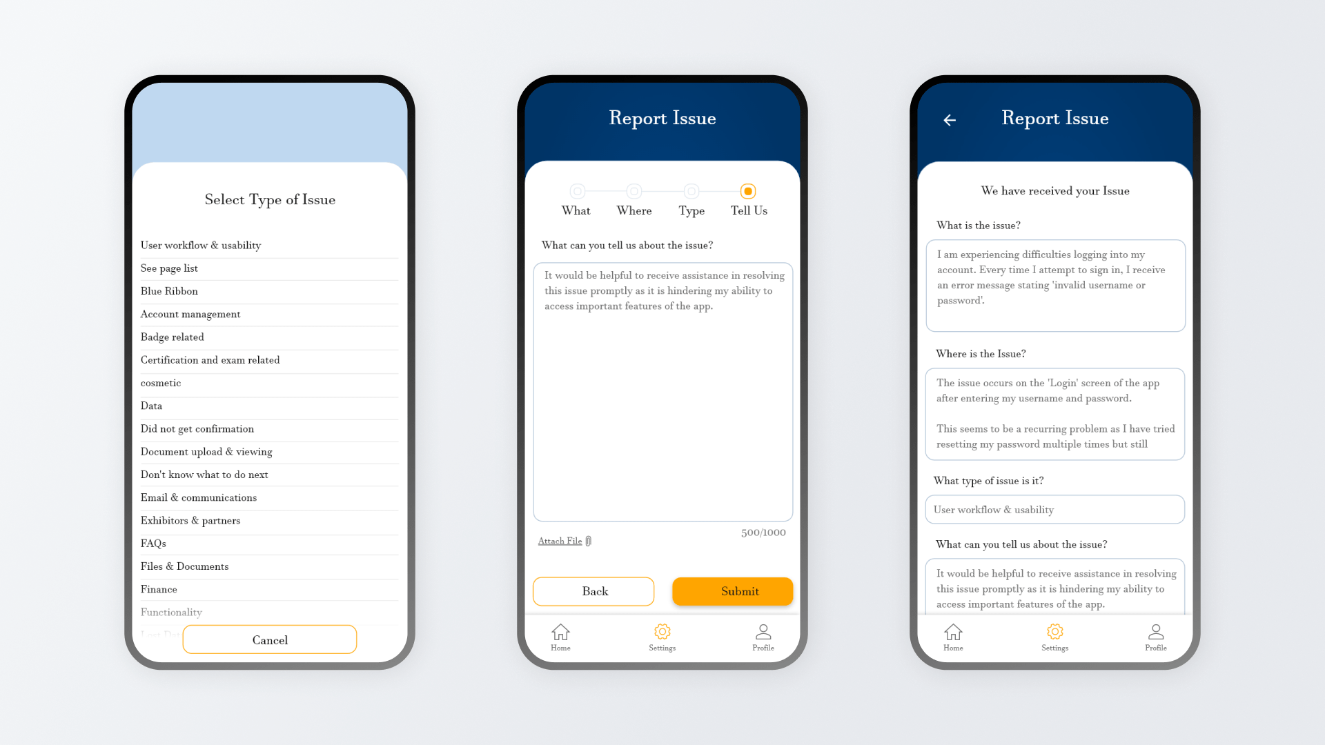
Managing Complexity Through Guided Workflows
Several flows within the product involve multi-step inputs, particularly around issue reporting and problem escalation. These flows were designed to balance completeness with usability, ensuring that essential information is captured without overwhelming the user.
Progress indicators, step separation, and constrained inputs help users move through complex tasks confidently. Each step reinforces context, minimizing the risk of incomplete or incorrect submissions while maintaining momentum on mobile devices.
Information Discovery and Knowledge Access
As the knowledge base grows, discoverability becomes a core UX challenge. The design supports browsing, searching, and filtering across questions, discussions, and documented insights. Lists are optimized for scanning, with visual cues that communicate relevance, recency, and status.
The layout accommodates dense information while remaining readable on smaller screens, allowing users to quickly locate prior answers, reference discussions, or ongoing issues without excessive navigation.
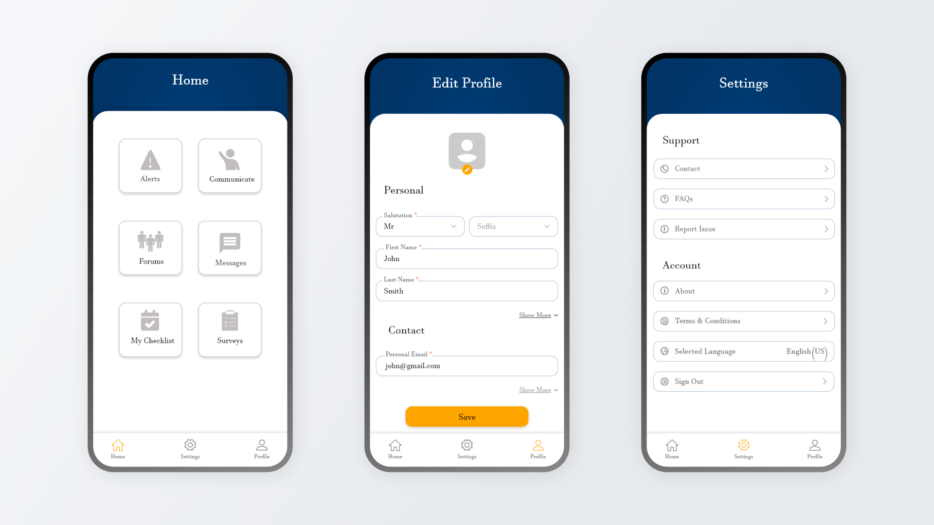
Mobile-First Design for Professional, Time-Critical Use
The product is designed for mobile use in professional contexts where users may be multitasking or operating under time pressure. Interaction patterns emphasize predictability, clear touch targets, and minimal visual distraction.
Consistency across screens reduces learning overhead, making it easier for users to move between tasks such as reviewing updates, responding to questions, or submitting new entries. The design favors reliability and clarity over experimentation.
Resulting Product Maturity and System Readiness
The final design delivers a stable, enterprise-ready mobile system capable of supporting structured healthcare communication at scale. By focusing on workflow integrity, clarity, and controlled interaction patterns, the product supports complex use cases without increasing cognitive load.
This project demonstrates my ability to design for regulated, high-stakes environments and to translate complex domain requirements into clear, usable product systems.