Rapido App Redesign - UI UX Case Study
Contribution Areas
ABOUT RAPIDO
Rapido is India’s first and fastest-growing Bike taxi app with a whopping 25 Million+ app downloads. In huge populated cities like Bangalore people prefer Rapido above very popular cab apps like Uber & Ola, as it is more affordable & fast when it comes to bike. They are now running operations in more than 100 cities. Founded in 2016, within a short amount of time, the bike rental company has quickly become one of the leading bike-sharing services in the world.
WHY I CHOOSE TO REDESIGN RAPIDO?
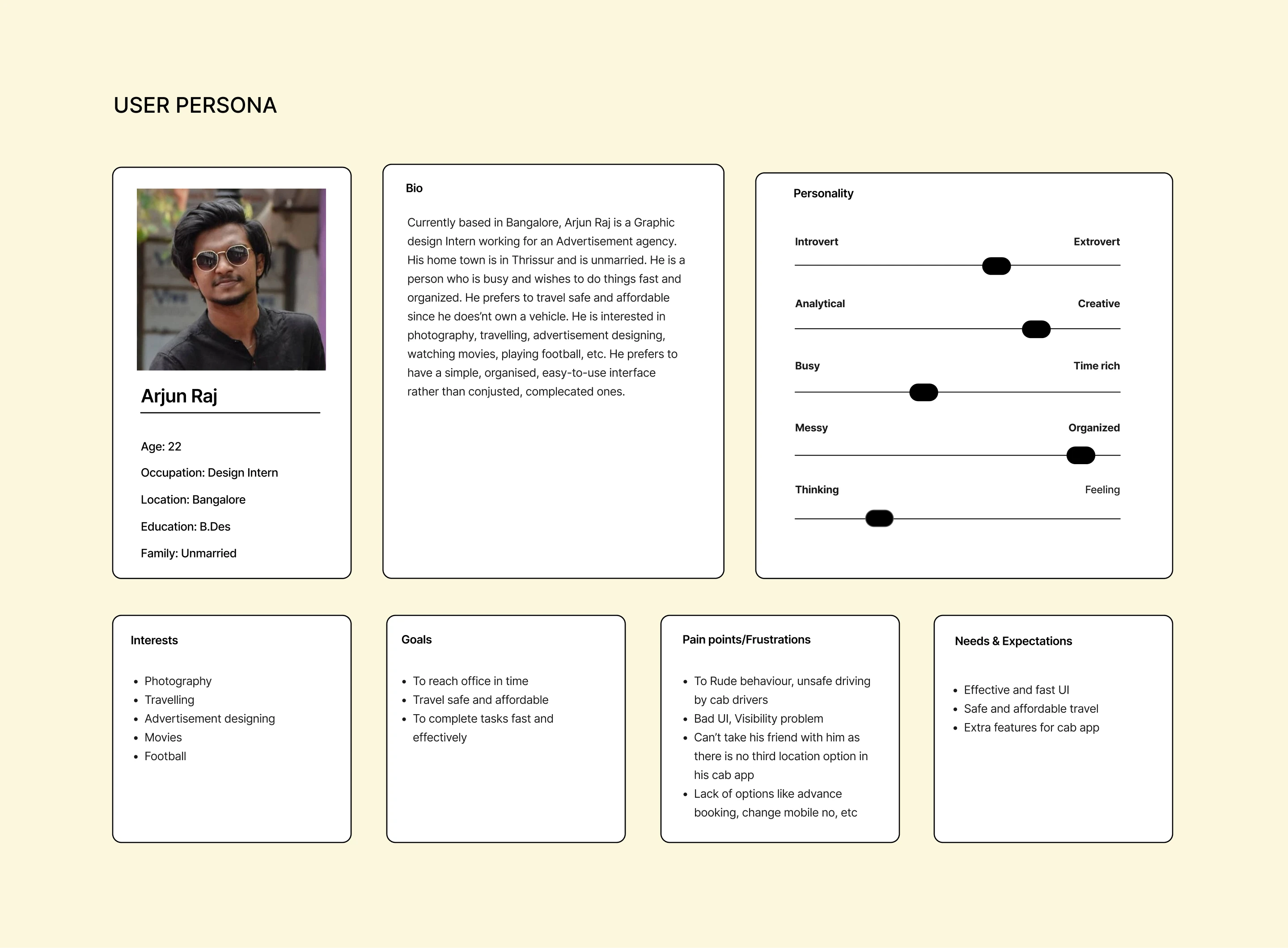
- As a daily Rapido user I came to understand the problems faced by frequent users rather than rare cab users.
- I choose Rapido for my daily commuting because its affordable but on using it personally I feel like its lacking so many features.
- As a creative design student I feel like its UI so pathetic and have so many problems like Visibility, Reachability, Congested, & lot more and thought it needs to be redesigned.
EMPATHISE
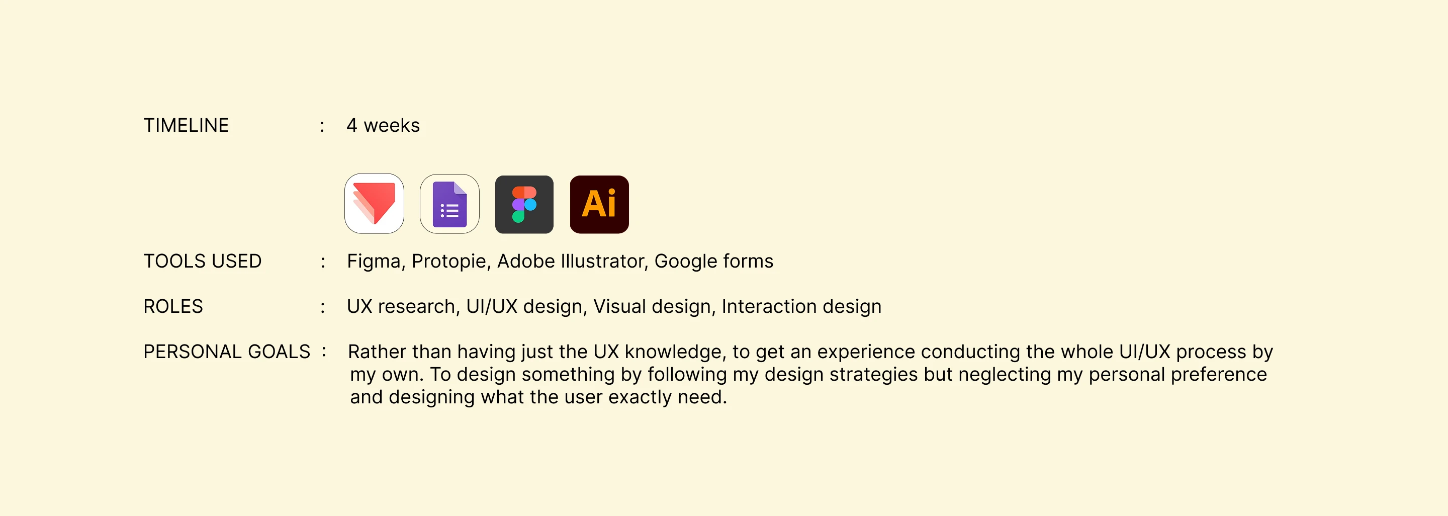
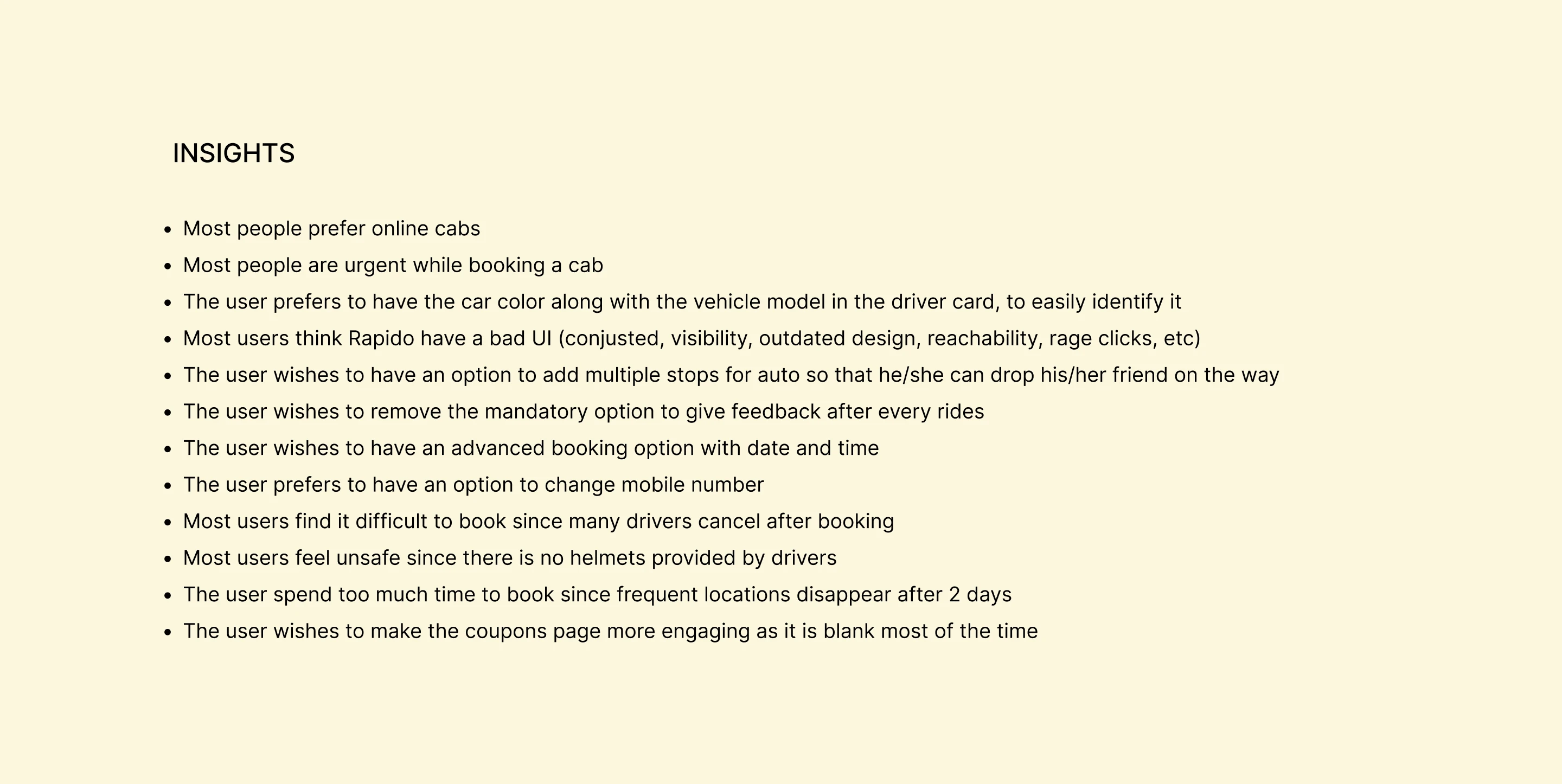
These are the research methods I used to gather insights:
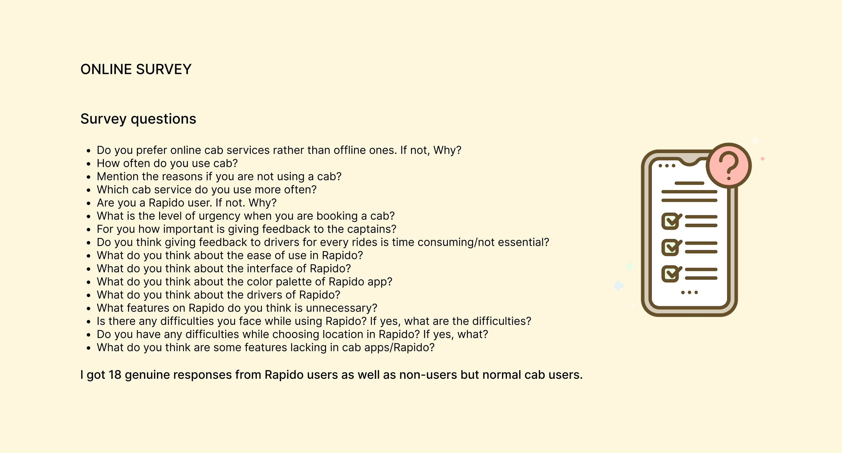
Online survey (18 responses)
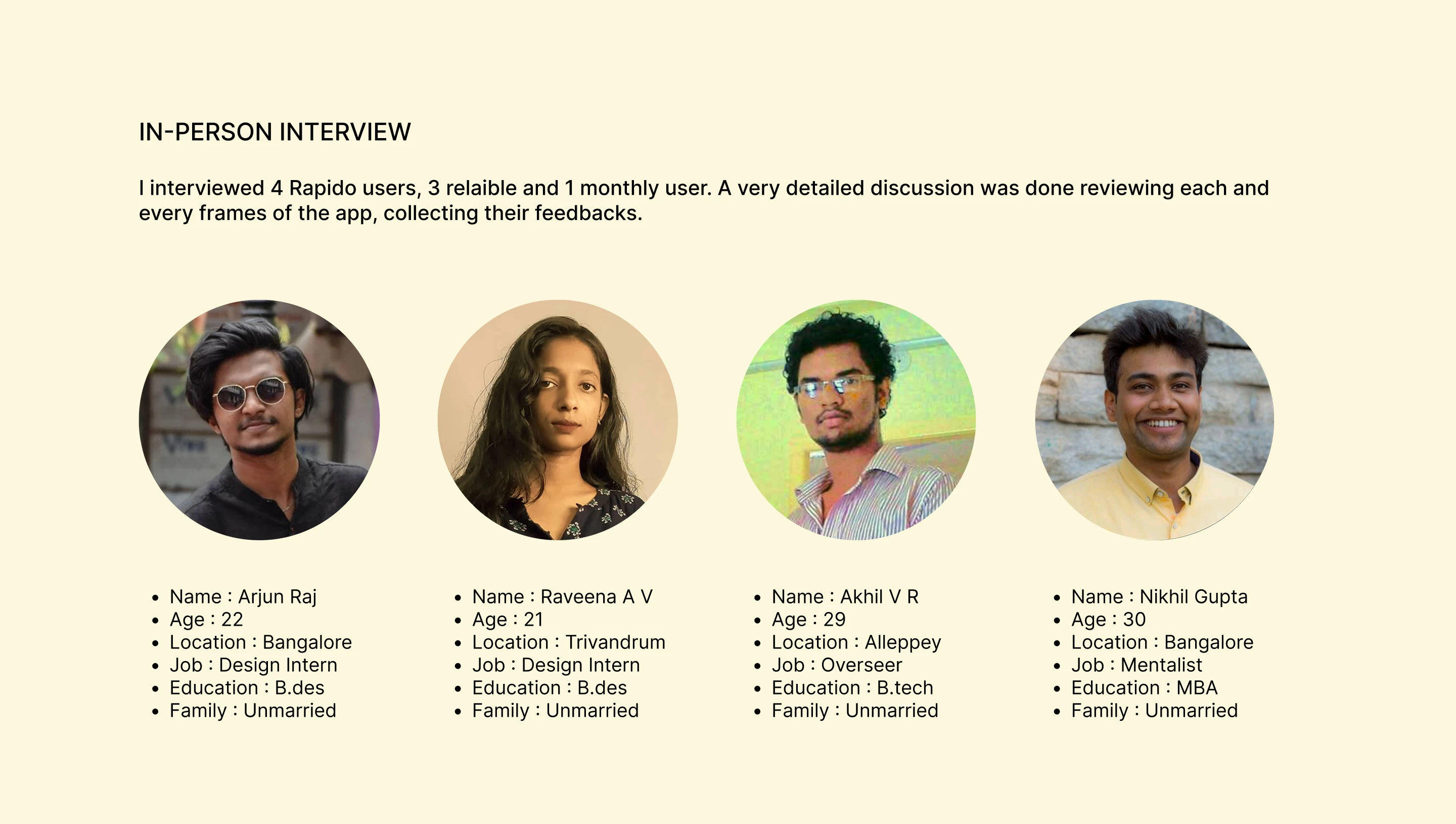
In-person interviews (4 reliable users)
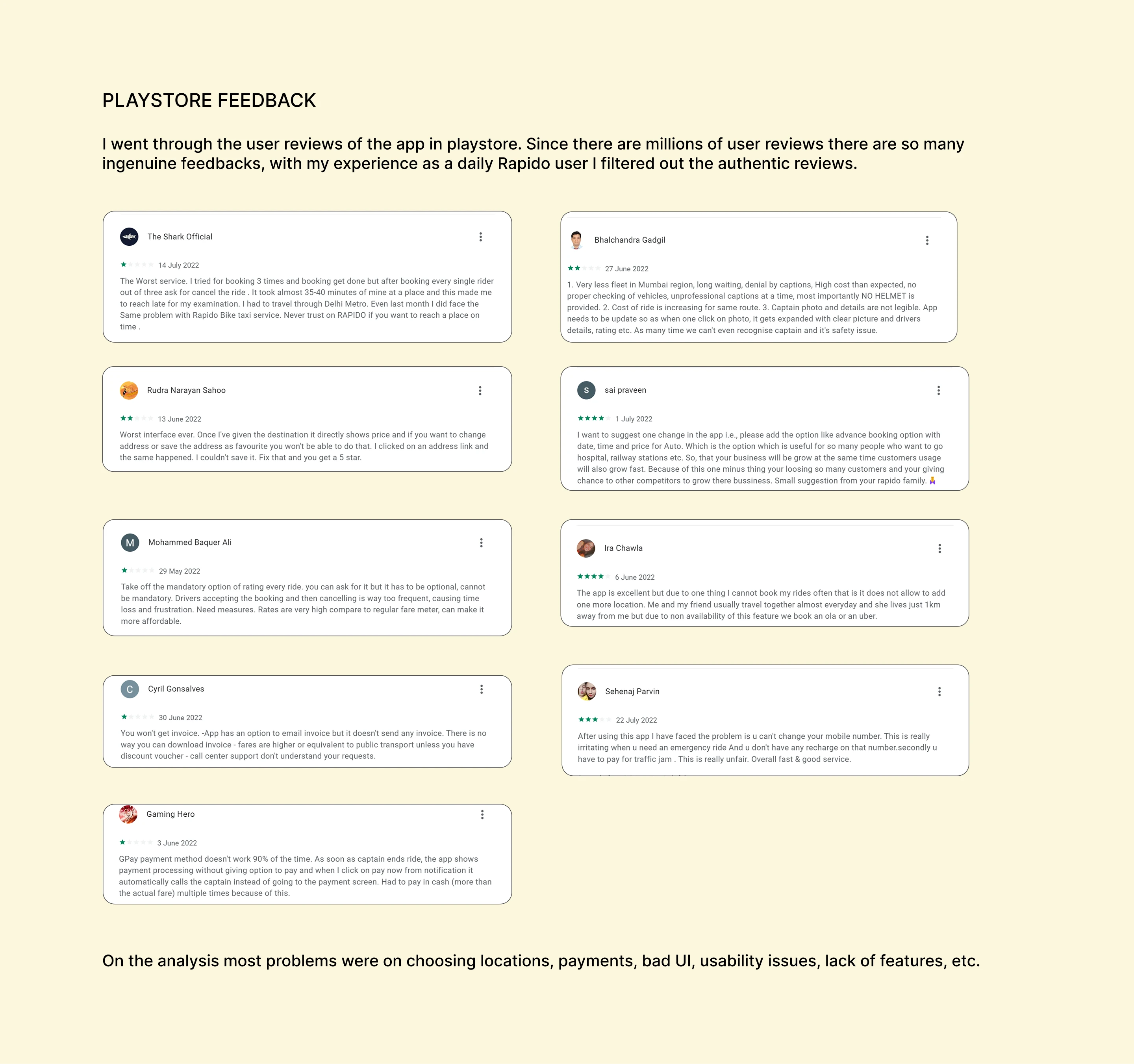
Play Store feedback from genuine Rapido users
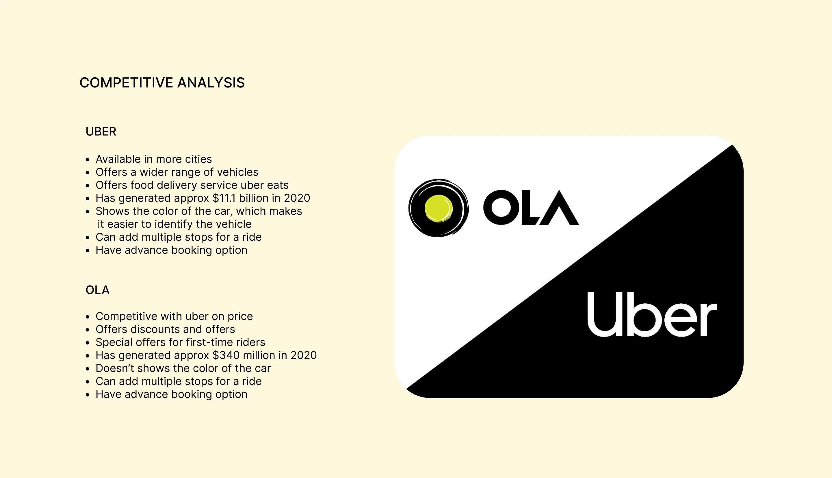
Competitor analysis
DEFINE
Problem Statement:
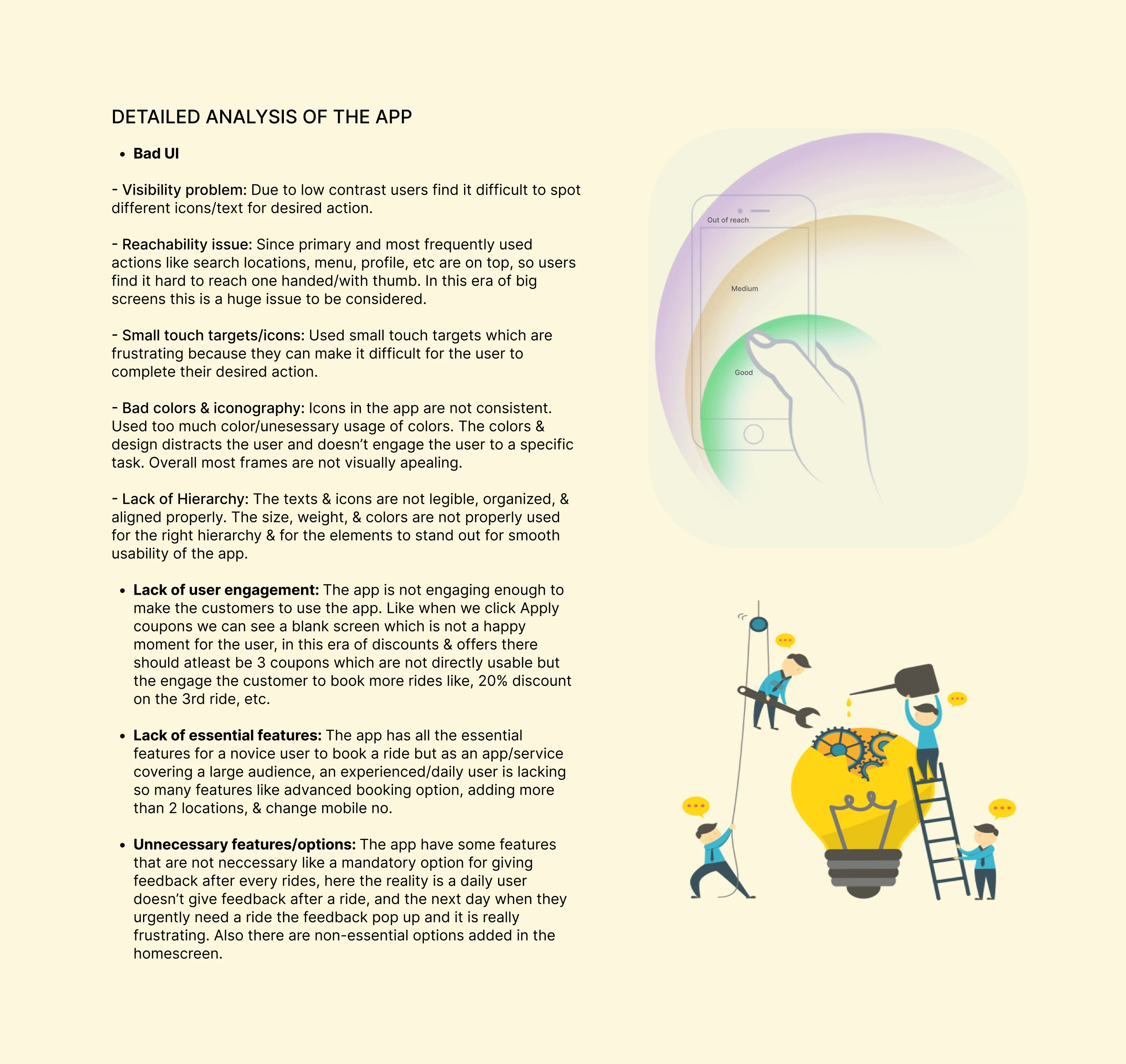
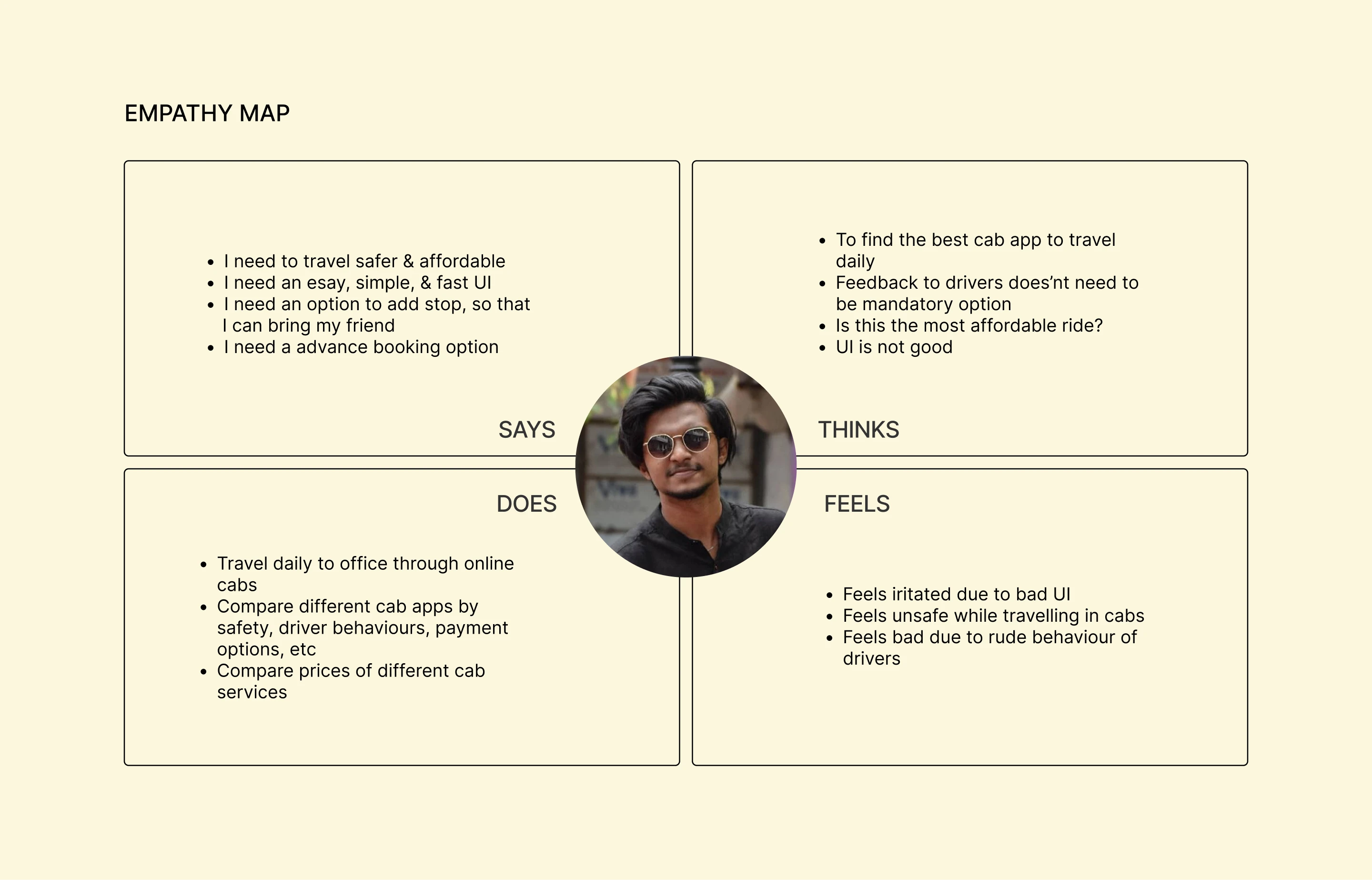
The app lacks user engagement & essential features and have unnecessary options in non-required areas making it more compicated and congested. Overall it have a very bad UI.
Solution / Design Strategy:
Through the design thinking process I am adding essential features for experienced users, replacing the unnecessary options, redesigning the frequently using frames so that it solves the reachability issue. And as a whole, redesigning all the frames to improve the UI and to make it more engaging.
IDEATE
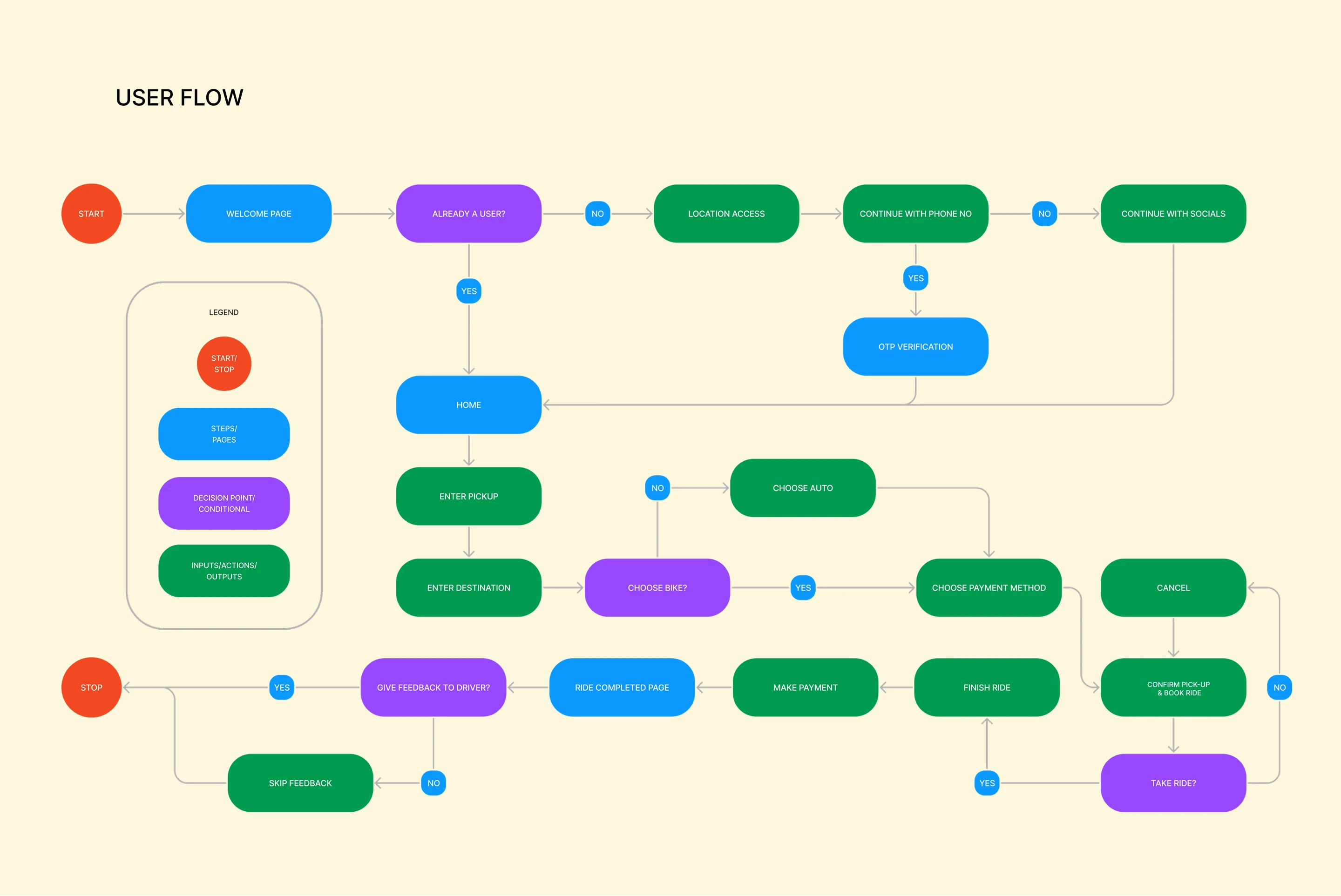
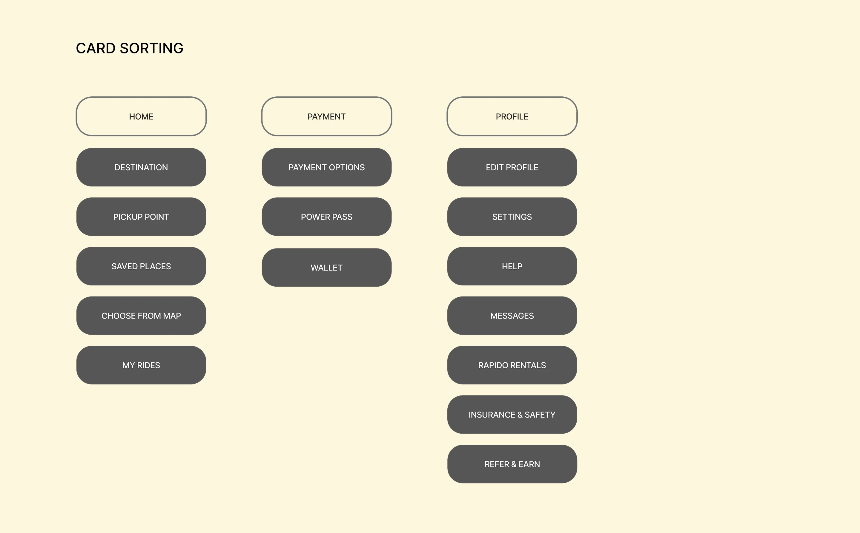
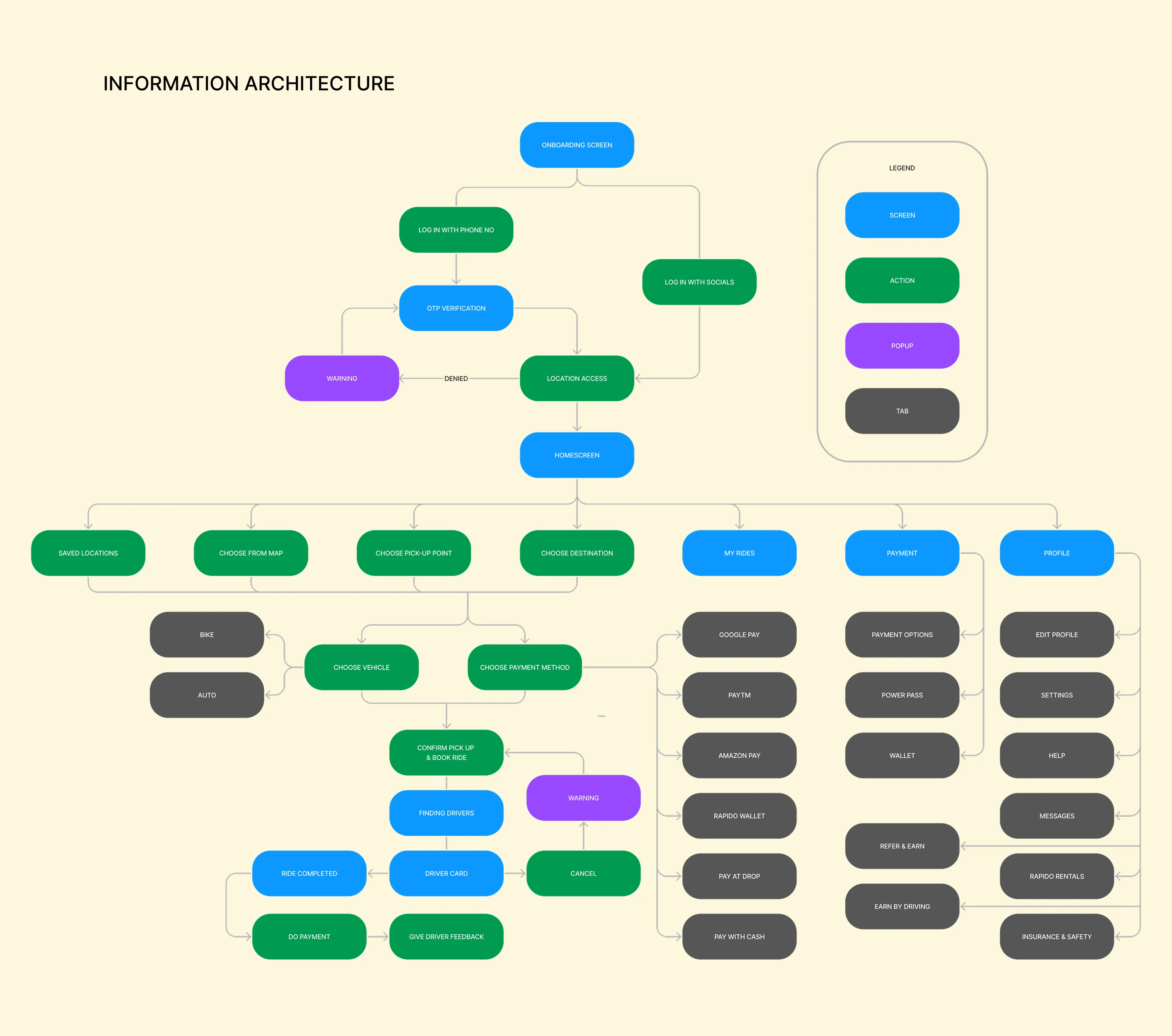
These are the final USER FLOW, CARD SORTING, & INFORMATION ARCHITECTURE, I made in Figma is a result of a lot of brainstorm sketches I done in paper to find the easiest, effective, and fastest possible way to complete the task/ride, keeping in mind the insights from the research, Hick’s law(states that more options in UI makes the user to do a decision more slowly), Miller’s law(states an average person can keep 7(+or-2) items of info at a time) of UX, and design principles.
DESIGN
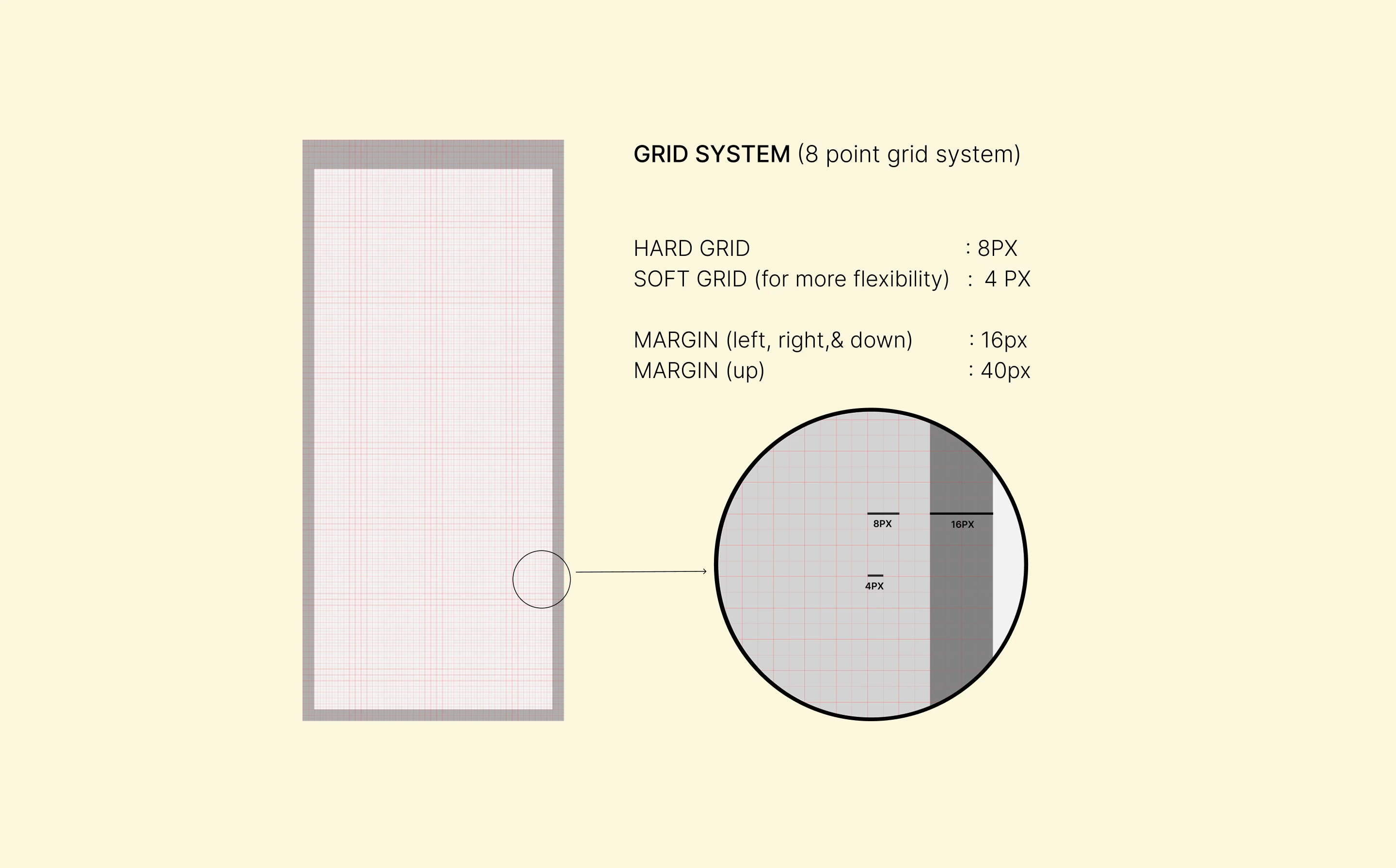
The design process began with low-fidelity sketches and wireframes to explore ideas quickly and validate core flows. These were refined into structured wireframes using an 8-point grid system to ensure visual consistency and scalability across screens.
Once the layout was finalized, I moved to high-fidelity UI design supported by a defined design language system, including colors, typography, components, and interaction patterns. Final screens and prototypes were built in Figma, with animations and micro-interactions created in ProtoPie to simulate real usage and test usability.
LO-FI WIREFRAMES
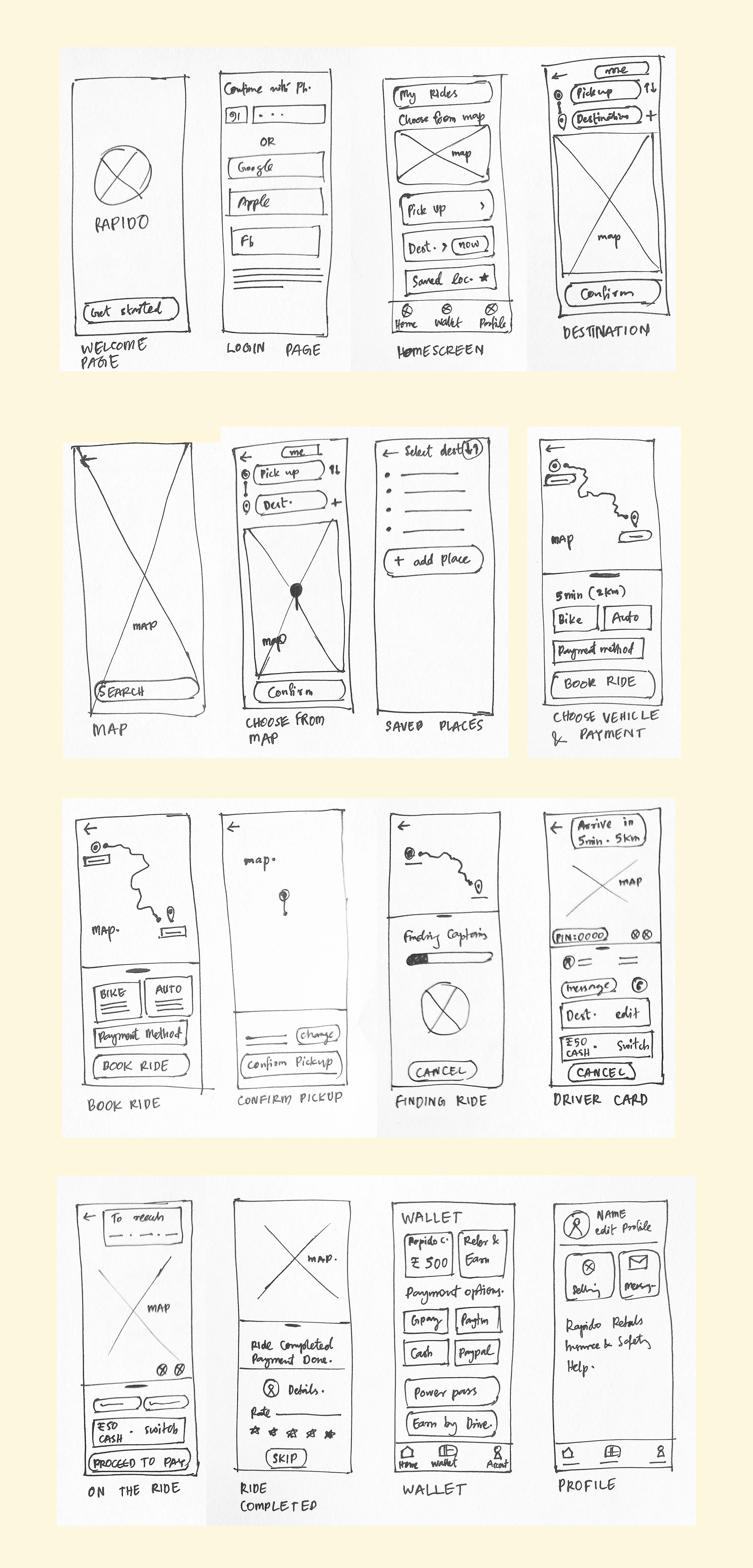
I have sketched wireframes of some major frames on paper to get an overall idea to create the hi-fi wireframes.
HI-FI WIREFRAMES
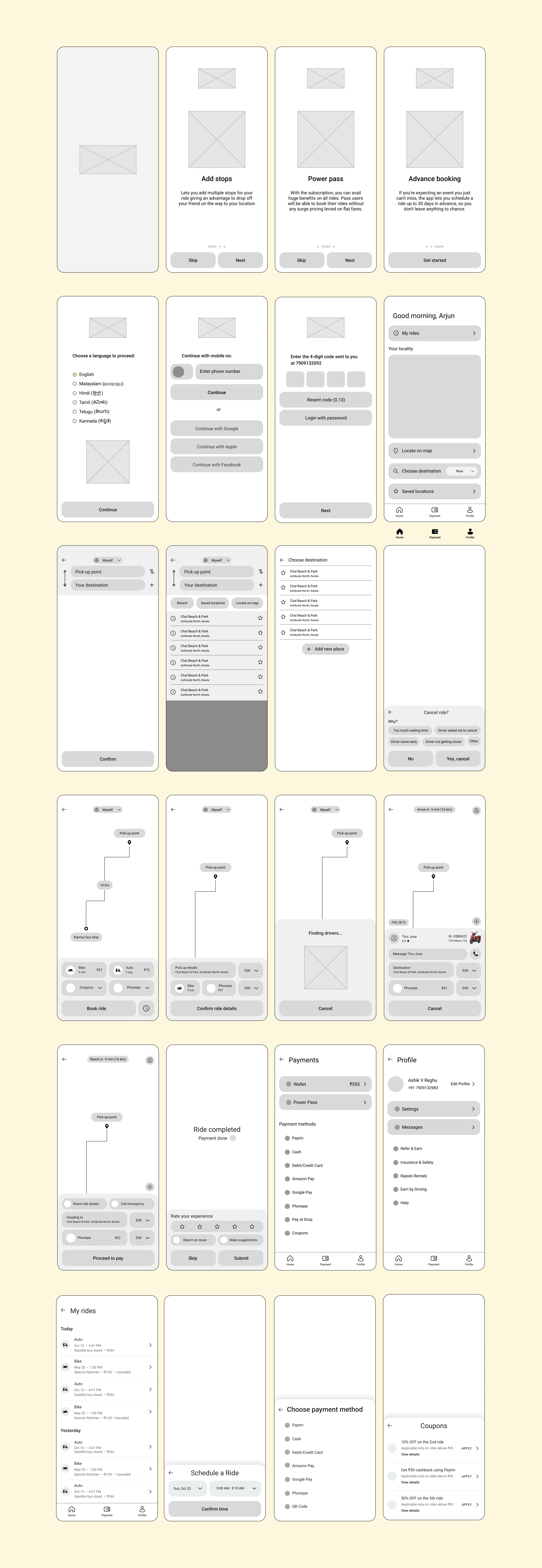
From the low-fidelity wireframes I have made high-fidelity wireframes. I have made so many changes, like adding some features as well as stripping down different options, unwanted text, icons etc.
DESIGN LANGUAGE SYSTEM
I have made the design language system to save time and to make the design consistent throughout the process. Since this app is more targeted to android users, I made this design system based on the Material design 2 Gudelines
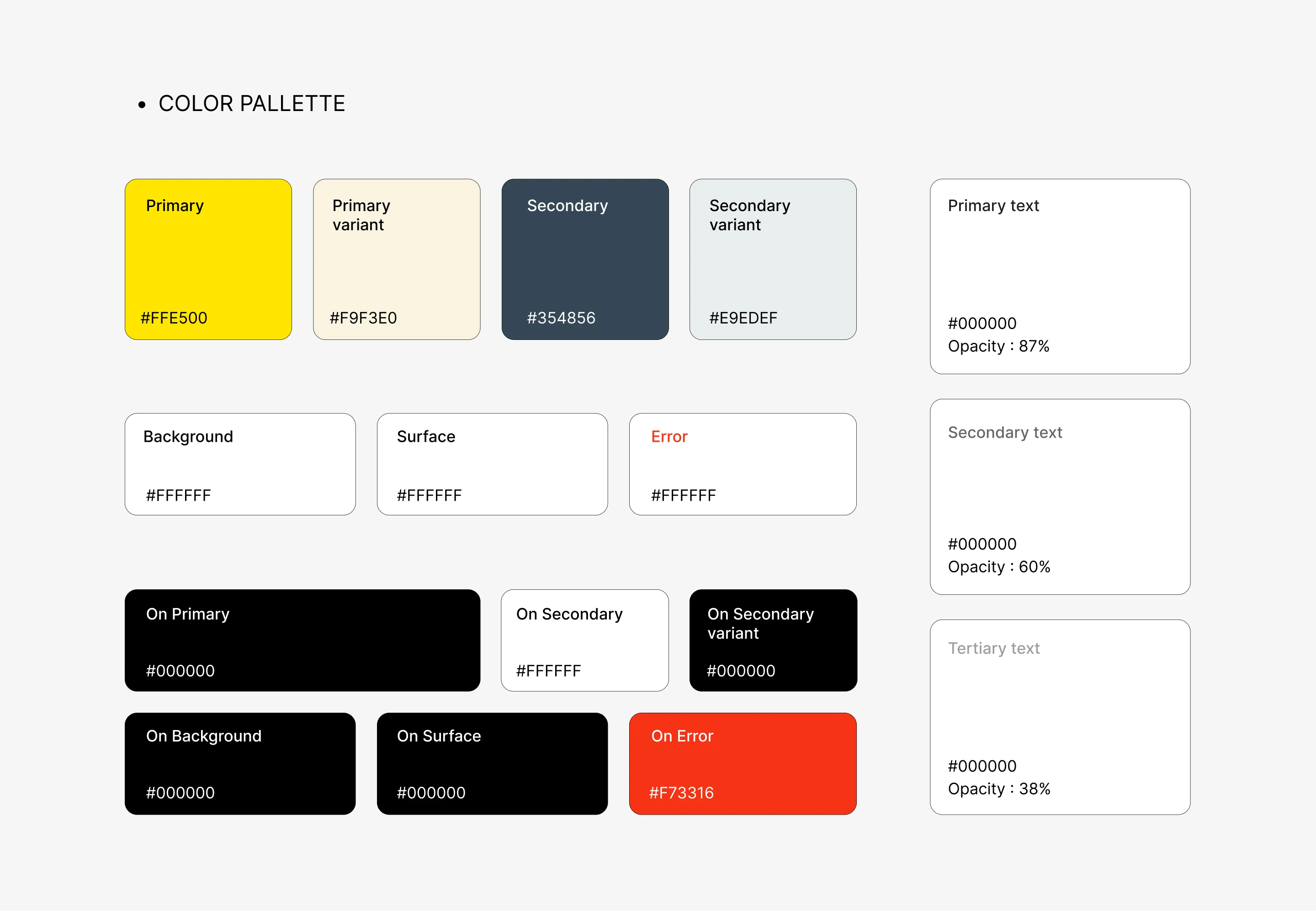
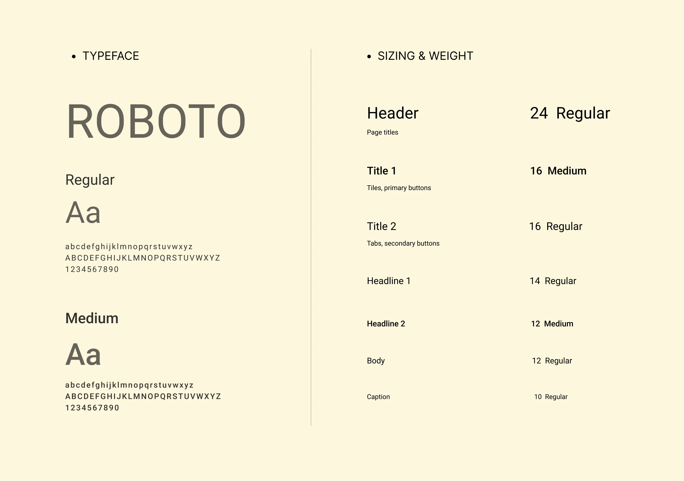
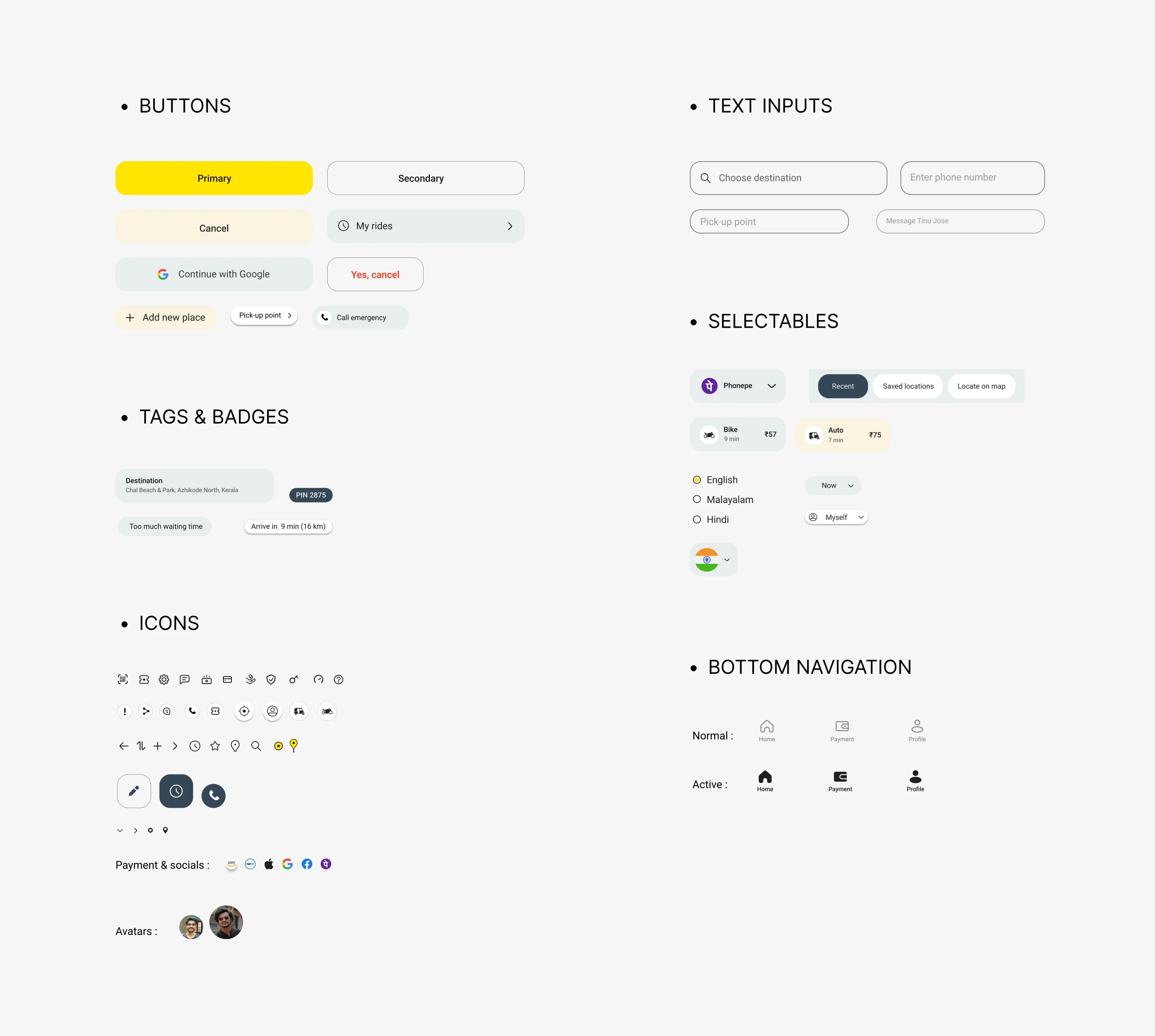
FINAL DESIGN AND USER FLOW
I have made the design language system to save time and to make the design consistent throughout the process. Since this app is more targeted to android users, I made this design system based on the Material design 2 Gudelines
ONBOARDING
These include selecting the language and introducing the users of newly added features like Adding stops during ride, Advance booking option, etc which was lacking in the original app. I used the color palette of the app to make the vector illustrations in the onboarding screens.
LOGIN
For login I made phone number as the primary option and socials as the secondary option, since most cab users prefers to continue with their number. After that there is OTP verification and location access.
HOMESCREEN & BOTTOM NAVIGATION
I choose bottom navigation to solve the reachability issue, which is a common problem when it comes to cab apps. I put home, payment and profile options in the navigation bar since these are found to be most used/needed options, according to the user study.
Added advance booking option, where users can book by choosing a time, date, & destination and know the estimate price, for an upcoming ride. Also added My rides, Locate on map, & Saved locations in the homescreen.
BOOKING RIDE
Here I added a new feature on top to add person, where we can type a name, and phone number, if we are booking cab for someone else, so that drivers can directly contact them for details regarding the ride. Also added advance booking option again in the booking screen.
After booking, added an option to confirm ride details, since many Rapido users have problem of drivers coming to the wrong pick-up location, since they given the wrong details, especially the pick-up location.
Instead of empty coupons page in the original app, I made the page more engaging by adding coupons which are not directly usable but engages the users to continue taking rides.
TAKING RIDE, PAYMENT & FEEDBACK
Made the screens more simple, & aesthetic than the original one which is more complicated & outdated. Important options are made more clear like PIN, driver details, color of the vehicle (for easily spotting the driver), etc.
In the ride complete screen I added option to skip feedback, which was not available in the Rapido app, which is a very frustrating problem for the many users when they are urgently booking a taxi.
Added elements of Gamification (celebration GIF) on ‘Ride completed’ text which encourage/engages the users to take more rides.
FULL USER FLOW VIDEO
This video walks through the complete end-to-end user journey, showcasing how the redesigned experience flows across onboarding, booking, riding, payment, and feedback. It highlights key interactions, transitions, and decision points to demonstrate how usability and clarity were improved throughout the app.
USABILITY TESTING
I have done moderated-usability testing rather than unmoderated (since it have so many limitations). And as a moderator I conducted the test in such a way that it avoids all the possible biases that can happen during the process.
I have tested the app with 5 users, all of them where Rapido/experienced taxi users. Using the interactive prototype I made using Protopie, I asked them to perform core tasks like booking a ride, change the phone no. , schedule a ride, find the power pass option, etc, to find if the user flow is fast, easy & not confusing.
Insights and feedback:
- User find it little difficult to spot ‘schedule a ride’ feature
- The user prefer more to swipe than clicking ‘next’ button
- Users was able to complete core tasks smoothly. without any confusion
- Users was able to spot different options/features without any frustration
